The Justice Index is a new project out of the National Center for Access to Justice at Cardozo Law School. It collects & displays data about how people in the US — particularly those who are traditionally disadvantaged in the legal system — are faring when it comes to access to legal aid services and courts. It is a step towards metrics & documentation of Access to Justice — which hopefully then can
ground a forward-looking agenda of projects to correct trends moving in the wrong direction.
Justice depends on having a fair chance to be heard, regardless of who you are, where you live, or how much money you have. The National Center for Access to Justice has created the Justice Index to help make access to justice a reality for all. The Justice Index provides a vivid picture of which states are following practices and providing the resources necessary to make the legal system fair to everyone. Our justice system is among the most highly regarded in the world and we cherish our ideal of equality before the law. But for too many people the reality falls short of the promise.
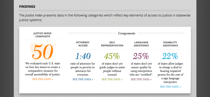
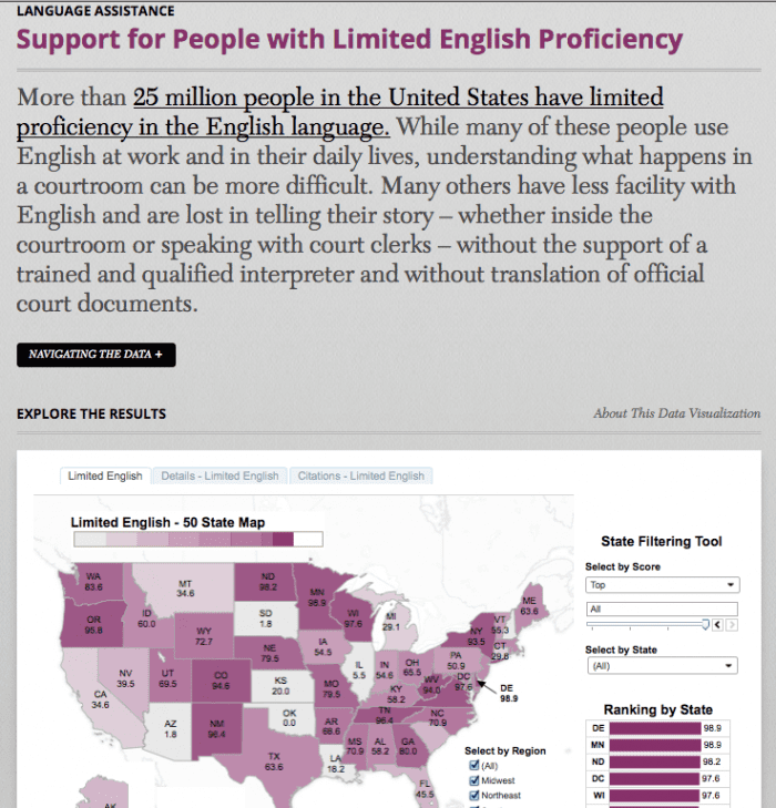
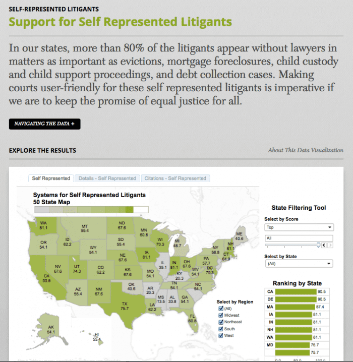
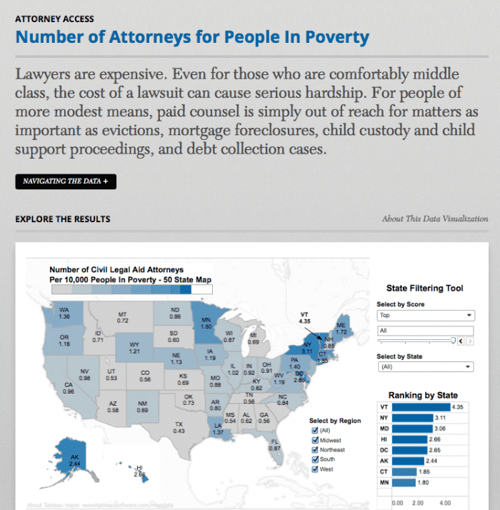
One of the guiding choices of Justice Index is to visually display the data through interactive, colorful maps. Here are some of the examples of how they’ve transformed data about access statistics into interactive visual displays. If you go to the site, you can play with the tools to filter & focus on the data that you’re most interested in.
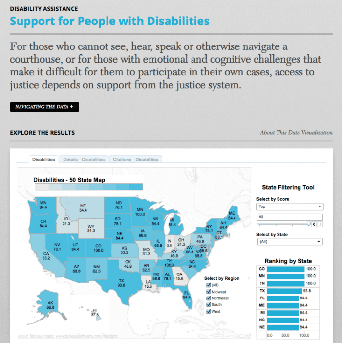
It’s great to see lively & informative displays of Access information — both to make the problems more visible, and to start framing the conversation about what our collective agenda should be (we, being designers, engineers, lawyers, and makers who want to conduct projects that have impact on access).


