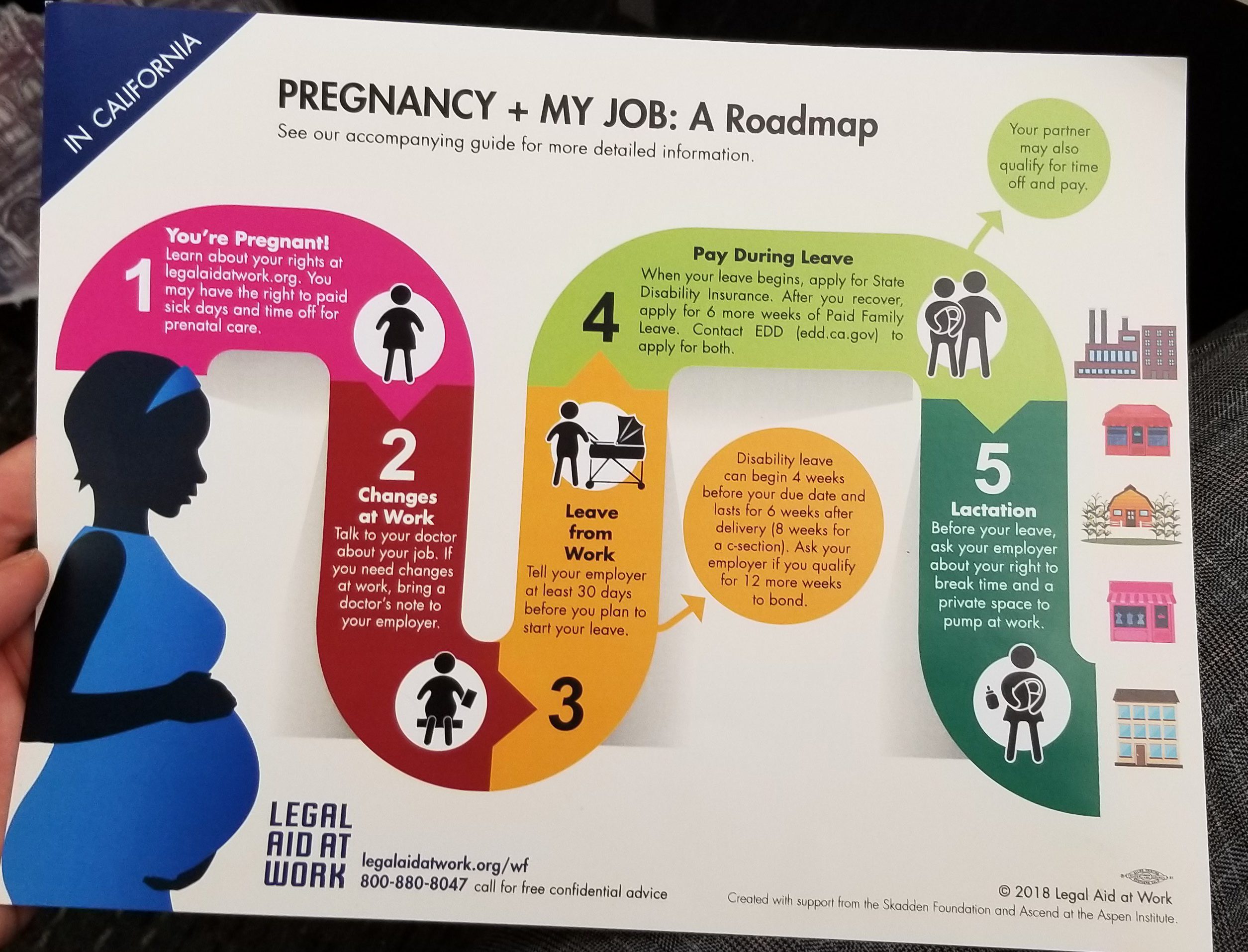
Here is a great example of visual self help. It comes from the legal aid group, Legal Aid at Work, here in San Francisco.
They went through an extensive design process to layout a more coordinated and understandable set of resources for people who are during pregnancy and their legal rights and obligations at work.
Some of the key visual principles they followed, that makes this such a promising approach:
- Bird’s-eye view, giving a full system map of what to expect in different phases of the issue
- Staging information, letting the user selectively deep dive into more content if they are particularly interested in that area
- Coherent color choice and image choice, to provide a consistent visual language that can become a point of reference and easy to glance at navigation system for the materials
I am so excited to see this kind of visual legal help develop, and if you have interest in working in a similar way, please talk to us! Our lab at Stanford is working on similar kinds of projects around housing and debt.
The next step would be to make this Multi-Channel! Now that Legal Aid at Work has made a coordinated set of fliers and booklets — can we use the same content and visual assets laid out in different formats: on mobile-friendly websites, on text message, on social media, and elsewhere that people might need it?.


