In our Prototyping Access to Justice class, Kursat Ozenc and I are leading student teams to get quickly from speculating about how the courts could be improved to implementing new concepts.
In our class today, in week 3 of the course, we had the students make some more progress along the Journey of Prototypes.
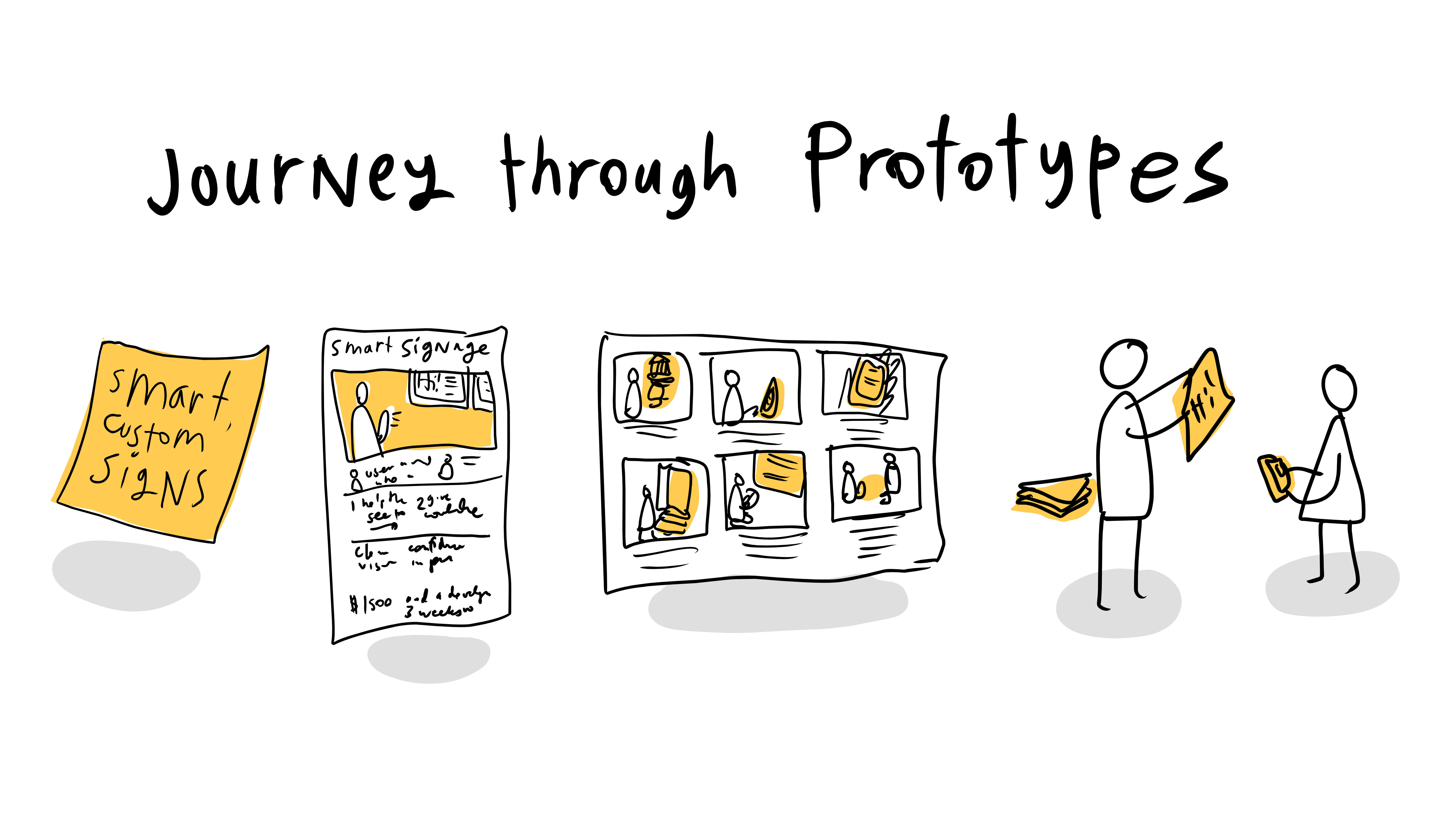
The journey metaphor is useful to hep anyone who has an idea for how a system (like courts or self-help centers) could be better — but doesn’t know how to make forward progress on it. We are creating a staged set of prototypes to develop, to go from the spark of an idea to a vetted, feasible concept.

Last week, the students had digested their research into how the Self-Help centers currently function. From this, they made journey maps and spotted opportunity points for intervention. Then, they brainstormed 30 new concepts for each intervention-point.
For example, what are 30 new ways to make sure a person can find their way from the entrance of the court to the right office? Or, what are 30 new ways we can help people get service of process right, and not fail here?
This was the first stage of their Prototype Journey — one line ideas on a post-it.
This is the most basic capture of the idea — hard to even call it a prototype. But it’s the seed that starts to lay out what the ‘it’ is, that will guide the rest of the design cycle.
From the post-it, the next stop is the Concept Poster — a slightly more robust prototype. We had the students sort out all of their post-it ideas into a hierarchy, and choose the top 6 ideas they thought had promise to be breakthrough and feasible.
For each of these top 6, they drafted a Concept Poster version of the post-it’s concept, that added more details on functions, target users, high-level value, and implementation requirements. The Concept Posters were then compiled into a catalogue, of the Ideabook.
The value of the Concept Poster as a prototype is that it can let your team quickly, visually present a range of ideas to experts and users. They can almost go ‘shopping’ through the ideas and figure out which ones are most exciting, do-able, and worth pursuing. It can help the team whittle down further to the best one to pursue first, or to reorient based on this initial input.
The Concept Poster/Ideabook prototype can also be a check-in, with the testers letting the team know if similar ideas have been tried before, could be replicated from elsewhere, or if the team should be talking to certain experts.
Once the team gets Ideabook feedback, then they can focus in even further to the first idea they want to pursue. For this single idea, they will flesh it out to the next stage of prototype: the Storyboard.
They go from one sketch of the idea to a visual flow of the entire, ideal journey the user has with the new concept. It lays out the key steps of how the concept will work, what the user will have to do, what the system/service-provider will have to do, and what the resolution looks like. All of this is the ‘happy path’ version of an implementation, where everything goes right and works out.
Once the team documents this ideal flow, they then use the prototype to identify the key assumptions they’re making about the user, the service-provider, and the system. By laying out the step-by-step of the ideal, they can see what needs to happen or exist in order for this ideal to be realized. The prototype helps the team spot what they need to test.
From there, the team quickly moves to the next prototype mode: The Wizard of Oz version. For each of those assumptions they’ve discovered in their storyboard flow, they have to make a way to behaviorally test whether it will really work the way they expect it to.
A Wizard of Oz prototype is an interactive realization of the idea. The user is not just reacting to a presentation of an idea — she is playing around with the ‘app’, or moving around in the new ‘space’, or considering whether to visit a ‘website’. The design team does not actually build a functional new app, space or website — but they use paper, sketches, enactment, and other hacks to simulate the concept.
The value of this prototype is getting more realistic feedback, about whether people will really engage with the thing you’re creating, if they’ll be understand it, and if they’ll get value from it. You can test the many assumptions baked into it.
Some common Wizard of Oz versions of prototypes are making paper-sketches of apps and then assembling them into a click-through using a tool like Marvel. Or putting a sign-up sheet for a new service or organization, and seeing how many people sign up or take the ad. Or, manually acting out a new tech-based service.
Each of these prototypes will let the team count behavior: how many people sign up? How many people are able to use the app you’re envisioning? How many people click on an advertisement for a new service? How many people stop to look and use a new electronic sign you want to install?
It also is valuable for more formal organizations like the court, to do something temporary and non-permanent — to demonstrate what is possible without asking for a large commitment immediately. Rapid prototypes of new signs, worksheets, space layout, or tech can show value, get feedback, and build momentum without any budget requests or committee approvals.
After the Wizard of Oz prototype, the teams will continue on their journey to more refined, content-rich, and tech-enabled versions of their ideas. But these first four steps of the journey help them get quick input, vetting, and refinements to make sure they’re on a promising track and doing something that will resonate with their various stakeholders.


