It seems lots of User Experience & Information designers have tried to tackle tax forms. These are all hypothetical versions (it seems the IRS is massively against any new updates). They are inspiring in how they simplify complexities and simply look more beautiful.
Considering all of these examples, I would love to see a ‘Skins’ option for tax forms. Each consumer could go with the form layout they prefer, and then the data would be formatted into a standard form for the IRS so they would not have to alter their intake methods. That seems possible for e-filing, though that misses the point of Access to Justice. For those tax-payers who don’t have the luxury of e-filing, there needs to be a better hard-copy document.
If there is no redesign of the actual document, then perhaps there can be a hard-copy Skin? It could look like a cheat sheet. Or an instruction form. Though an extra page might just add bulk & confusion. What would a hard-copy skin look & act like? This a design challenge to put on our list.
So, on with the tax redesign!
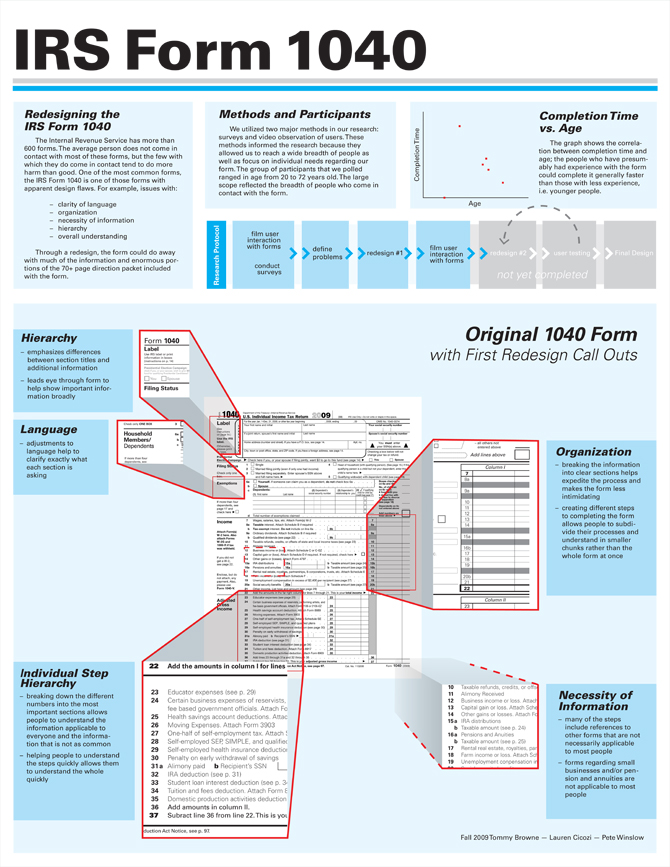
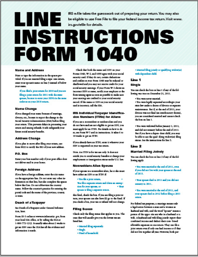
Here is one from Pete Winslow and his design team, with annotation of the survey & interview information and how they influenced the team’s design process.
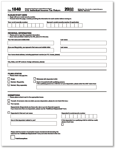
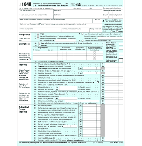
Another, from Gregg Bernstein. Here’s what he says about his redesign.
IRS Form 1040 Redesign: The standard individual income tax form, the IRS 1040, is indicative of the lack of user-centered design forced upon the public. Used by every conceivable demographic in the United States, the form seems to have been designed in an effort to promote mistakes and confusion. Because of its broad circulation and poor design, I centered my usability redesign class project on the Form 1040.
The form violates many principles of usability: it has no discernible starting point, no clear path toward completion, a lack of hierarchy, a plethora of alignments and inputs, and a dearth of plain language.
The redesign is a trade-off of sorts: instead of squeezing an incomprehensible design onto one sheet of paper, the revision opts for aesthetics across multiple pages. The printing costs, however, are mitigated by the potential reduction in audits, revisions, refilings, and mistake-induced restarts.
While the proposed redesigns do not venture into taxes, credits, income, and refunds, the proposed revisions serve as a template for their layout.
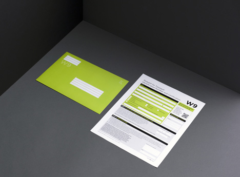
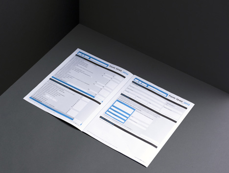
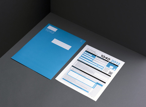
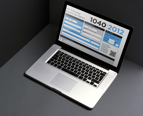
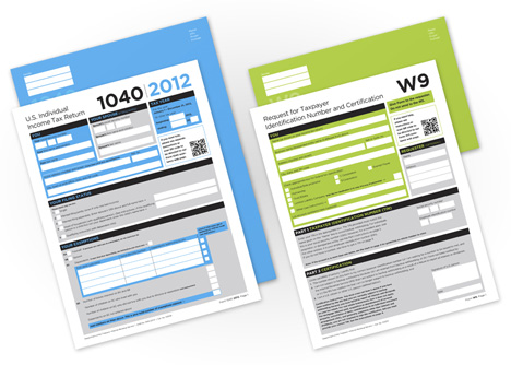
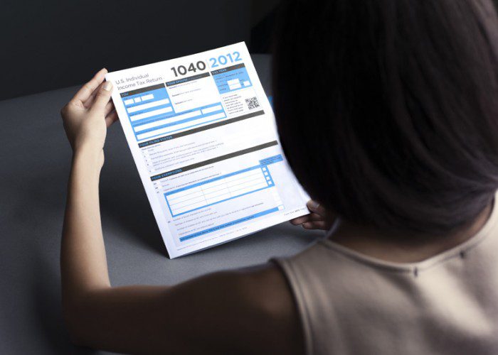
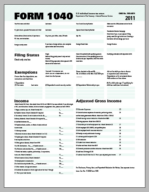
The New York design studio FormNation produced beautiful, colored 1040 and W-9 forms as well. These perhaps are my favorites.
FormNation describes their approach:
Since their inception, taxes have proved something of a confusing and downright unpleasant phenomenon, leading them to be listed alongside inevitabilities like death. A look at the current tax forms suggest that now more than ever, design can really help to innovate, promote ease of use, and add value to business and society.
This year when designer Jan Habraken sat down to tackle his taxes, he encountered the regular black and white cluttered paper with a mish mash of fonts and a maze of boxes. Instead of waiting for a change of heart by the IRS, Jan and his team at FormNation set out to create a user-friendly solution themselves.
“I’ve had this idea for quite a while,” says Jan. “I brought it up with my team at FormNation about it because I thought there was an obvious need out there for a simple tax form that people could complete themselves without getting an instant headache. This is the direction that people want, but instead they often find themselves with added stress at tax time because they feel overwhelmed at decoding the forms.”
FormNation set out to design a clear and easy to use form. The clever inclusion of color that allows users to prioritise parts of the form, streamlined fonts, and uncluttered space are indicative of genuine efforts by FormNation to minimise the confusion associated completing paperwork at tax time. “It’s about positive change where we can,” says Jan. “Change in the broad sense can be transitional, revolutionary, and transformative. It’s about making life easier, and making things more possible.”
This tax form is just one way in which FormNation is encouraging collaboration in fields where design hasn’t been seen as necessary, or an afterthought. Once viewed as something purely aesthetic, the design industry has grown cognisant of the fact that design shouldn’t be confined to their peer groups. “People care about design, it really can improve their lives,” says Jan.
And one final design from Ruben Caneda.
