
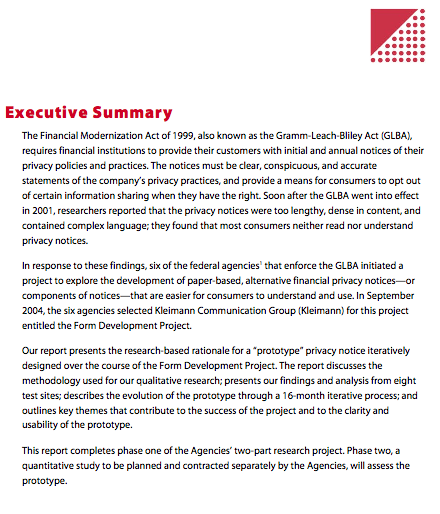
I dug up a report that the FTC had published a few years back on how they have evolved good information design for financial institutions to give privacy & legal notices to their lay customers.
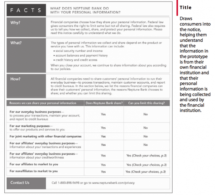
The document is a rich set of patterns, examples, and procedural insights into how to design legal (and law-relevant, rights-relevant) information for real, accessible consumption by consumers.
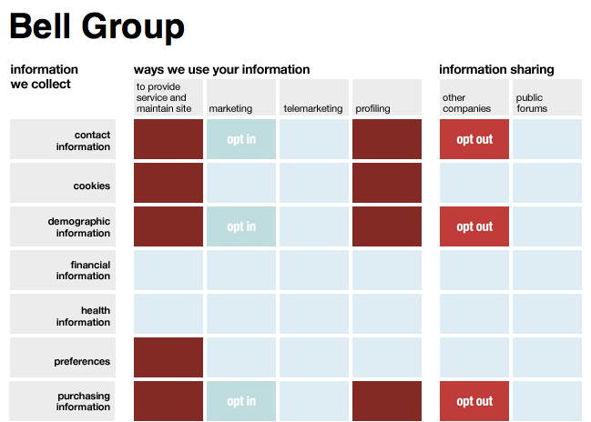
It is exciting to see policy-makers devoting so much attention to how customers actually receive & intake notice disclosures like those attached to credit card contracts. There is more room for innovations on the front of color and interaction — especially when the lessons pulled out by this document are transferred to digital experiences, like on the mobile phone, on the tablet used as a cash register, on the Google Glass interface with the world.
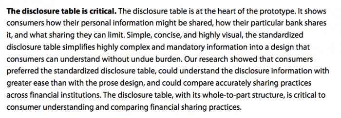
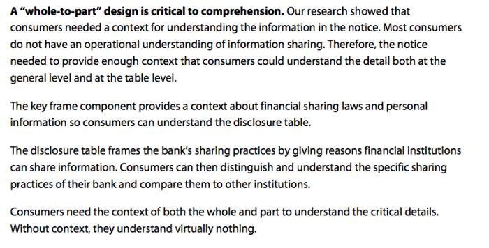
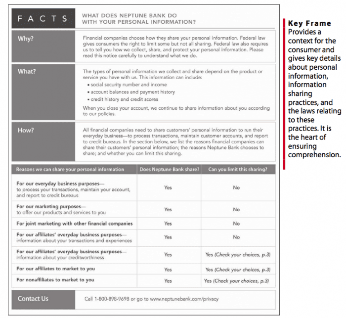
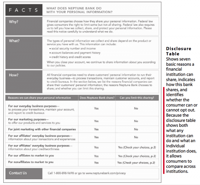
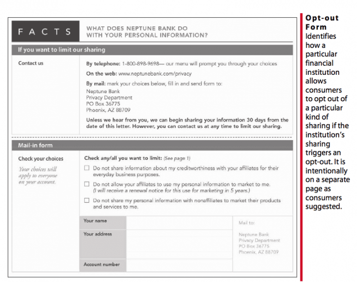
But I love how they called out some central insights about how average consumers intake legal information, and what design principles can be used to maximize accessibility.
I’ve snapped some images of these insights, as well as some of the prototypes that they concluded their process with.







1 Comment
Thanks for posting. That’s a really clean, crisp design for a privacy policy. Nothing like the reams of text that most online services throw at you.