One of the student fellows at Legal Design Lab has been encoding a whole range of similar legal policies, tagging up which sections of different institutions’ policy documents belong in the same category. This allows for a more comprehensive analysis of the policies, as well as comparisons across documents.
The question is, how to take that encoding and analysis work, and then make it usable to other people who might be interested in it? Perhaps:
- users of these policies (who are affected by what the policies say, or who are shopping among institutions and their policies),
- or the authors of them (to understand how they stack up against their peers),
- or even regulators who are interested in assessing what is normal and who is deviating from standards.
There are two models — both from the Carnegie Mellon University’s ongoing project on usable privacy policies — that present ways to present complex legal policies in a public, interactive way.
Model 1: Visual-Color coding of clauses
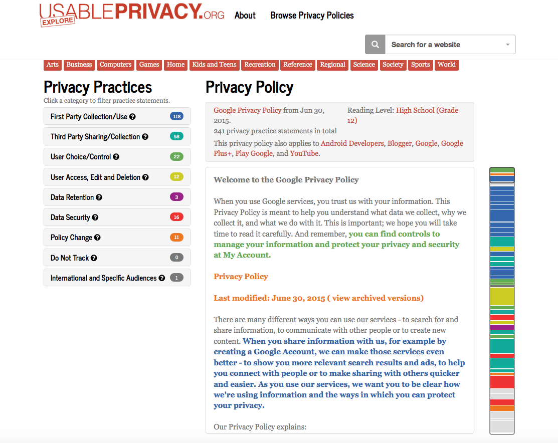
This comes from the Usable Privacy Project’s Explore site.

The policy (in this case, companies’ privacy policies) are presented in full, but with advanced navigation via color and quick-jump left menu. The team has:
- tagged up the parts of websites’ privacy policies,
- color-coded these different categories, and then
- presented the text of the policy in these colors,
- along with a menu that lets them jump to all clauses in a specific category,
- and a color graph so you get a sense of the density/placement of different categories’ clauses
Model 3: Search and Compare Tables
This second model, also from CMU’s Usable Privacy work — this time on Bank Privacy policies, has more of a focus on table-based comparisons of different companies’ policies against each other, based on a shortlist of designated factors.
This visual model is different:
- it shows a comparison table with seven key factors that the arbiter (the CMU team) has designated as important
- its color codes have meaning, with red/yellow/green/grey having some value-judgment about the policy
- it lets you compare institutions across these factors
- it’s less about the policy itself — the text is not displayed as prominently, but rather is summed up into the table display
These two different visual models for policy display offer inspiring concepts for lawyers and others trying to communicate complicated policies in more direct, interactive ways. Which do you find more useful?
My instinct is that Model 1, with its preservation of many of the policy text’s complexities, but with a color and navigation overlay, is good for power-users of policies — who are already confident in being able to understand the legal text and terms, but who want a quicker way to access and oversee the policy.
Model 2 could serve the lay consumer better, because it hides much of the legal complexity, and offers the guide of a schematic to let the user know what to pay attention to in the policy, and what the policy says on these key factors.
Another observation 1: Model 1 is beautifully designed, with its color coding and clear navigation. Even if the functionality is mainly for power-users, its visual design elements could be incorporated into more consumer-friendly displays.


