During my February trip to Italy to talk about legal technology and improving the usability of courts, one of the points that got raised several times was:
“How can we make effective visuals, that let both lay people and legal professionals easily understand:
- how the legal system and its procedures work
- how competing legal arguments over an issue or question of fact compare to each other, and link back to the question at hand, and
- what the meaning of a legal rule is.”
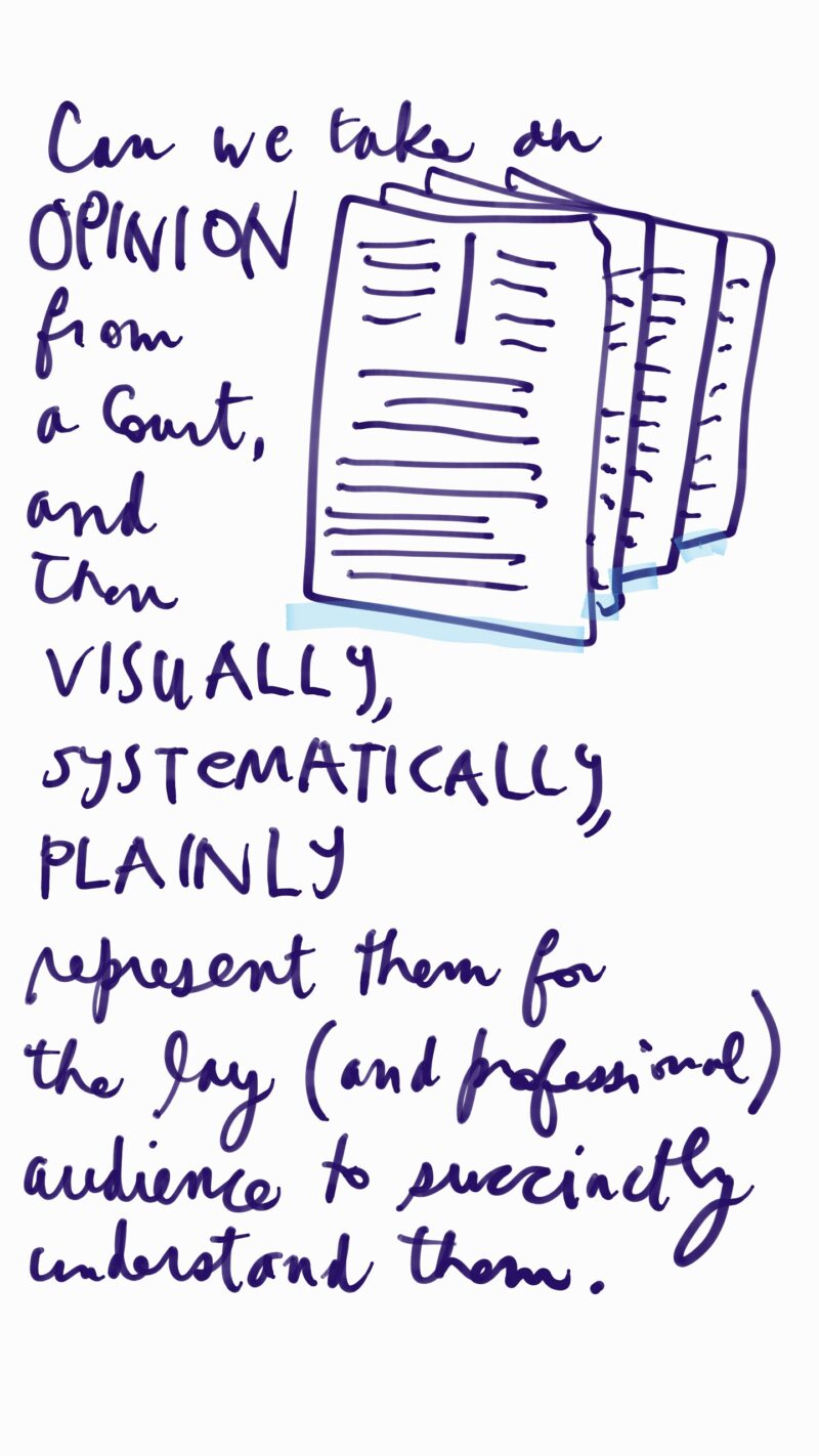
In response, I started sketching out some different visual models that could work for representing legal content.
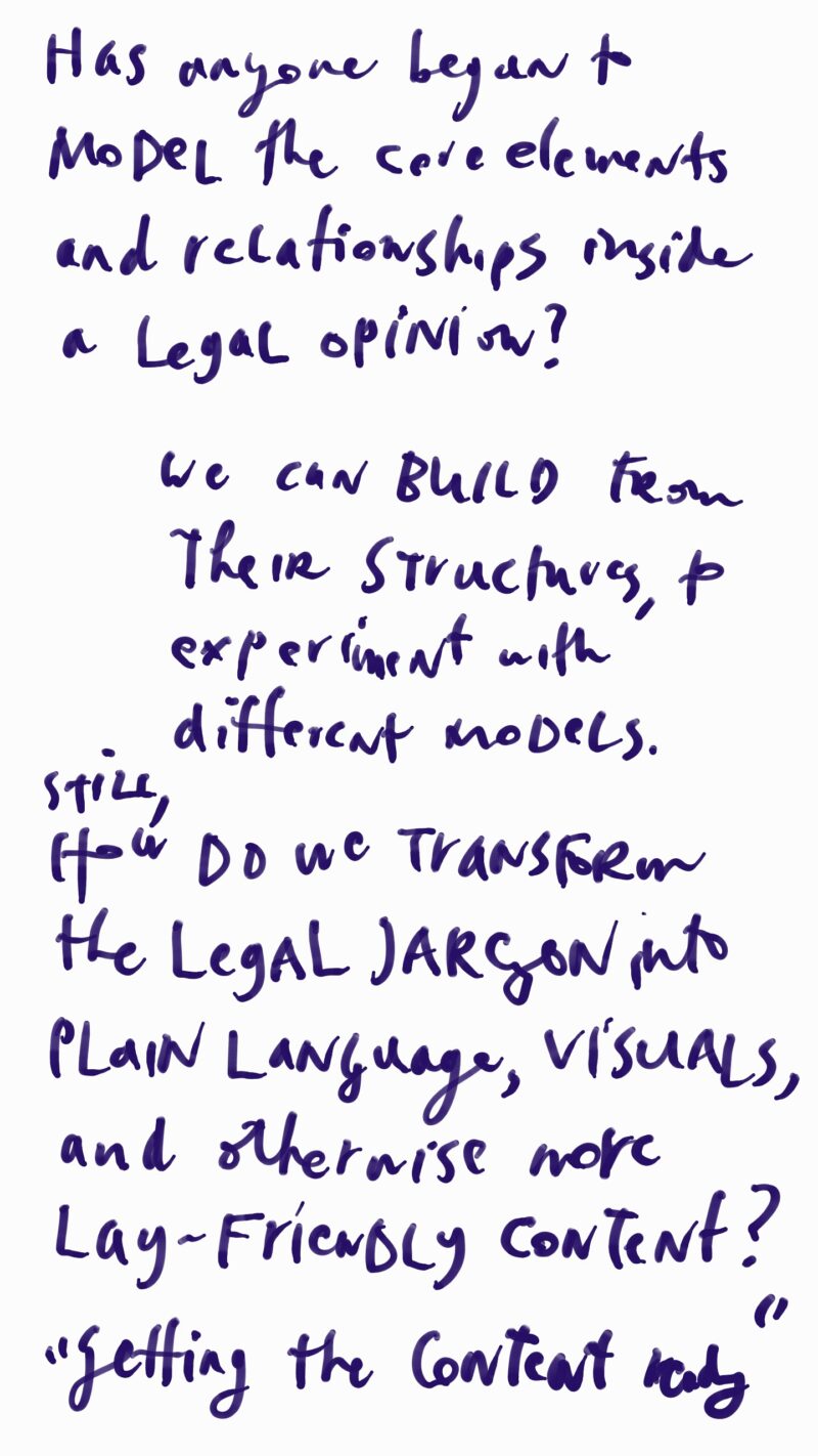
Please leave feedback or ideas — these are just initial rough sketches!
Representing Legal Arguments
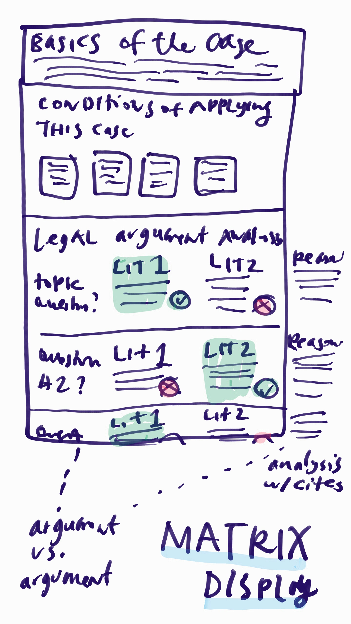
This type of presentation would be useful for judges, clerks, and law students — laying out the core categories of content related to a case in question. It would provide a matrix view of arguments, to make it easy to compare them against each other. Once the judgment on the arguments has been made, then the selected argument can be coded in a distinct color or font to show its priority.

Wiki Representing Legal Rulings
Another model proposed was a Wiki model, that would summarize what a rule or case says, how it emerged, and what other rules and cases it relates to. It would be more for students, lawyers, and self-represented litigants to understand what the rule is and the conditions around applying it.

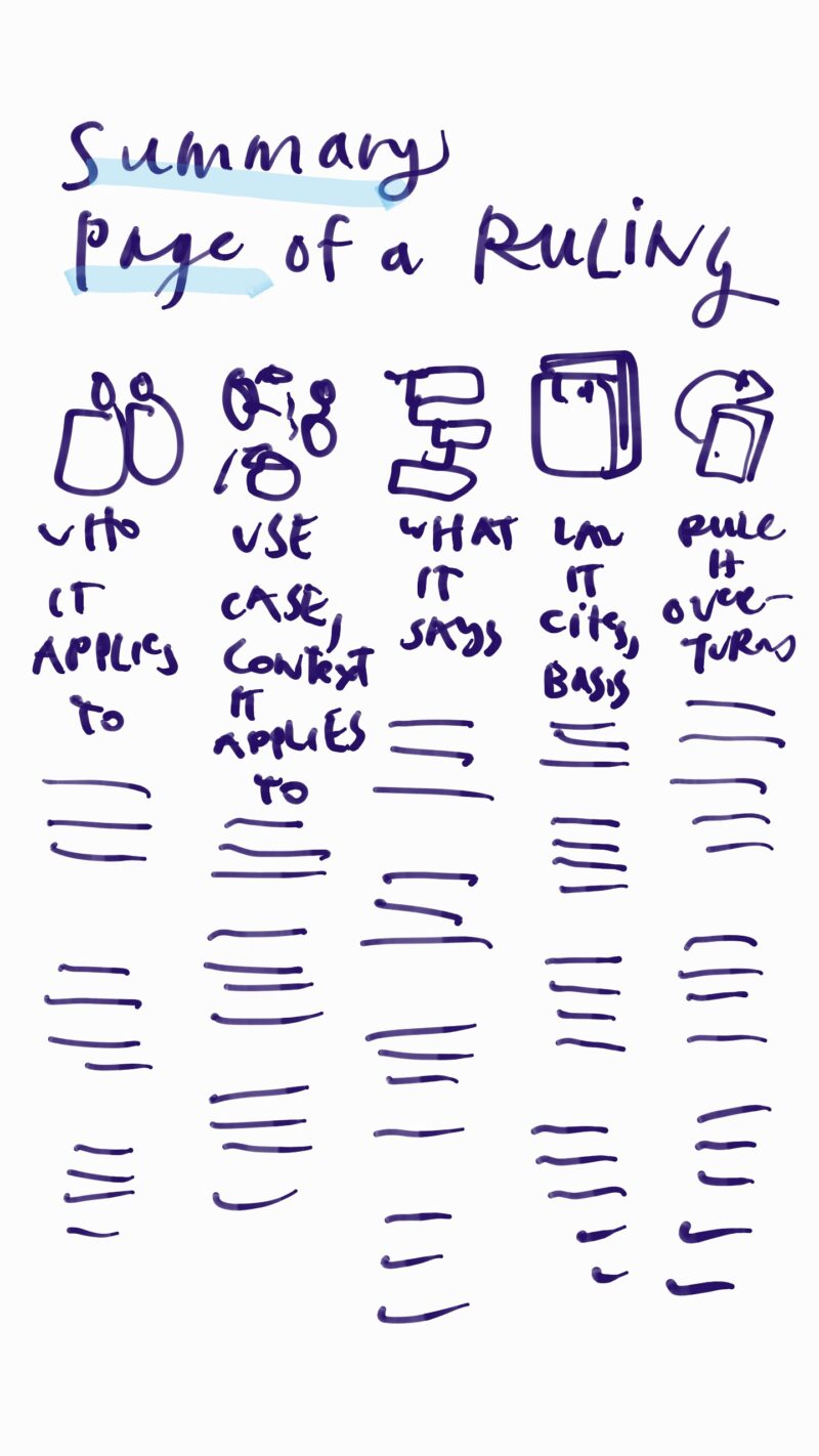
One-Pager on a Rule
Linked to the Wiki model, but with more icons and structure to make a legal rule representation that could be captured in one sheet, poster, or image.
It would have a standardized set of categories that would be marked with bold titles and icons, so the reader could quickly comprehend what to pay attention to, and process what they’re reading.
The Logic Tree to show arguments
The classic representation for argumentation is a branching tree — like an outline with hierarchies of points and supporting points, but with more visual markers. I’m not particularly excited about this visual mode, but it could be a useful first version. The trees could be collapsed and expanded as needed by the reader.
Why am I suspicious of it? Because they tend to look overcomplicated and intimidating to readers, especially if there is more than one argument or finding being represented. It can turn into an unwieldy graph, that doesn’t necessarily help people engage and understand.
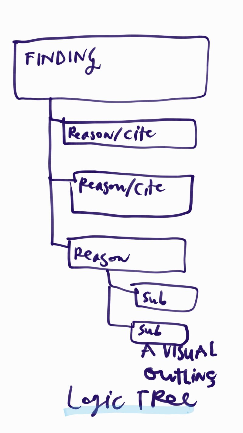
But I see that it is also one of the first go-to visual representations that lawyers tend to use when structuring arguments, so there is definitely something about the logic tree that makes sense to (at least lawyers’) mental models. I need to sketch more about what a more usable, less wild version of these logic trees could be.

5 Comments
There were good conferences on visualization in law at Cardozo and New York Law School some years back, gathering an international group of scholars in the field.
One interesting area is how to visually model arguments in cases or contexts that are not rule-based or logic-driven, e.g., when ‘balancing tests’ are in play. See my ‘On Balance’ article – http://link.springer.com/article/10.1007/s10506-015-9163-0.
Defining a visual language of court opinions is an interesting challenge. Some courts embed what I consider to be meaningful visual content in their opinions by means of headings with different levels of indentation and font-weight. These help the reader to grasp the tree / outline structure of the opinions – basically, (1) facts of this case, (2) law in this area, (3) how the law applies to this case – with sub structures for each part of the opinion.
When I was a law student, I carried around 4-6 colors of highlighter so that I could color-code different sections of opinions for quick reference. (Helpful when you might be called on and grilled on the previous night’s reading!). I’d use separate colors for procedural posture, key facts, bright line legal rules, and the primary arguments / reasons for the court’s decision.
Honestly, I think the hardest thing about court opinions for lay people is their length and the distraction of reading copious citations & footnotes. Finding a way to make the law more transparent to non-lawyers would be very valuable. Design-oriented lawyers would obviously be helpful for this.
In my current project, we’re working hard on other design problems in the legal space. The first is representing facts of complex cases and how they are supported or rebutted by evidence. The second is visually representing complex litigation deadlines and case phases that almost always extend over multiple months and, therefore, aren’t helpfully viewed on standard calendar layouts.
All so interesting! If you have any examples or sketches of your work, I’d love to blog about them.
Argument maps are useful not only for representing and analyzing existing writings, but also for thinking through issues as part of a problem-structuring process or writing process , which has been called “reflective argumentation”.
Margaret, this is impressive. I like how you break down all the info into a matrix view. What inspires you to come up with these mind maps?