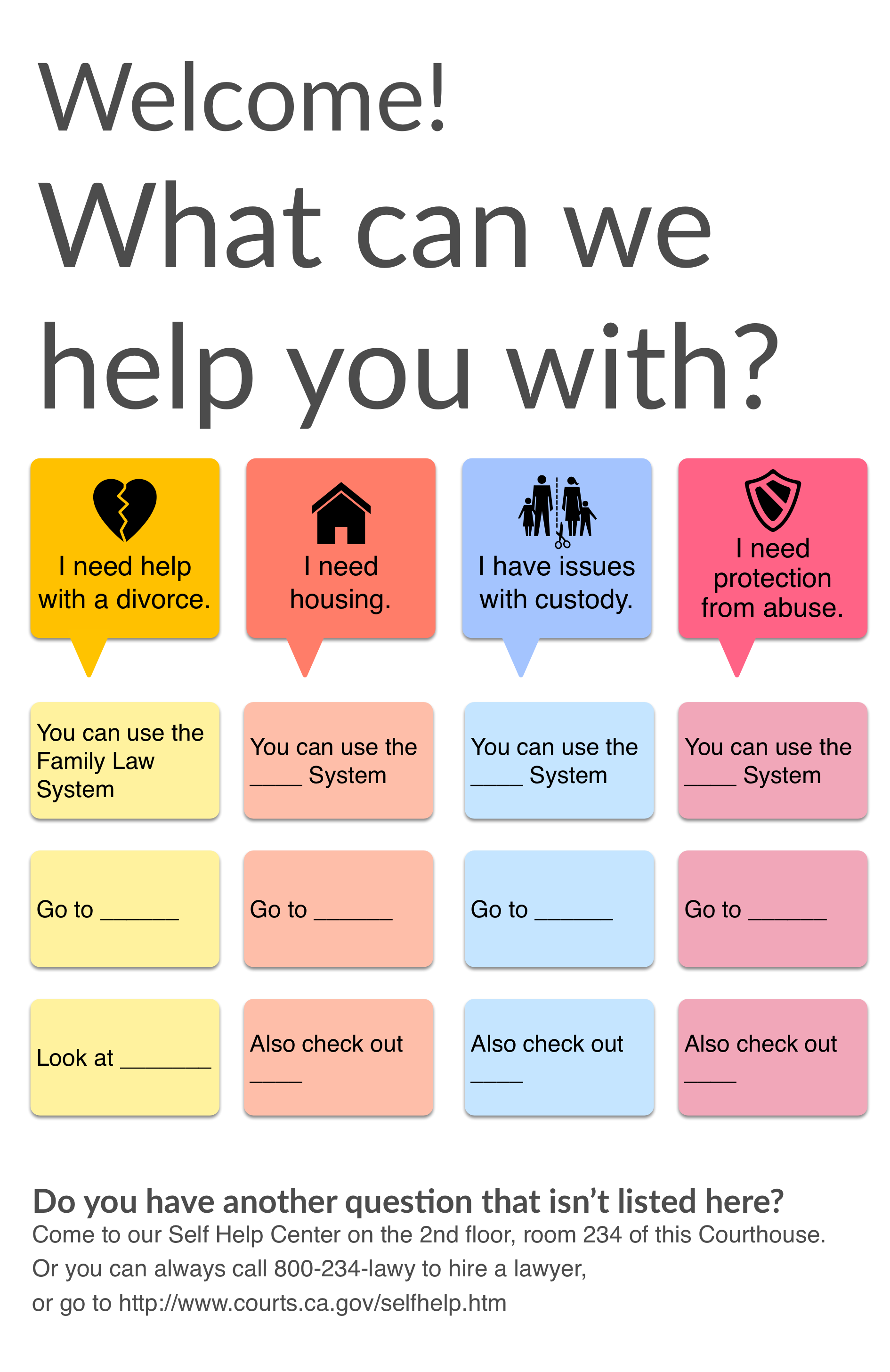
This poster is my slightly improved version of a paper-sharpie-poster concept from yesterday’s Beyond The Bench user centered legal services design workshop. I led it with a small team from the Legal Design Lab. We posed the challenge to court workers: how can you serve your client communities in more effective, accessible, and coordinated ways?
One group had this relatively straightforward concept: can we put a big poster inside the entrance to the court house, that greets people who are new to the court processes and gives them some quick orientation (and perhaps even accompanying worksheets, right underneath the poster) about common issues.
It would be a form of triage — to help a person quickly identify if their issue is one of these common ones, and where they should be going (in this building, online, or elsewhere). It would also be a welcome tone-setter, to help give people some more comfort and confidence by greeting them directly instead of making them hunt through the courthouse for resources.
It’s clearly a rough first draft, but I was going for big bold text, graphic colors, a limited menu of common options, and just the high-level “you must know these things” for each issue area.
Any thoughts? Would you put this up in a court? What would you change about it?


1 Comment
[…] Sourced through Scoop.it from: http://www.openlawlab.com […]