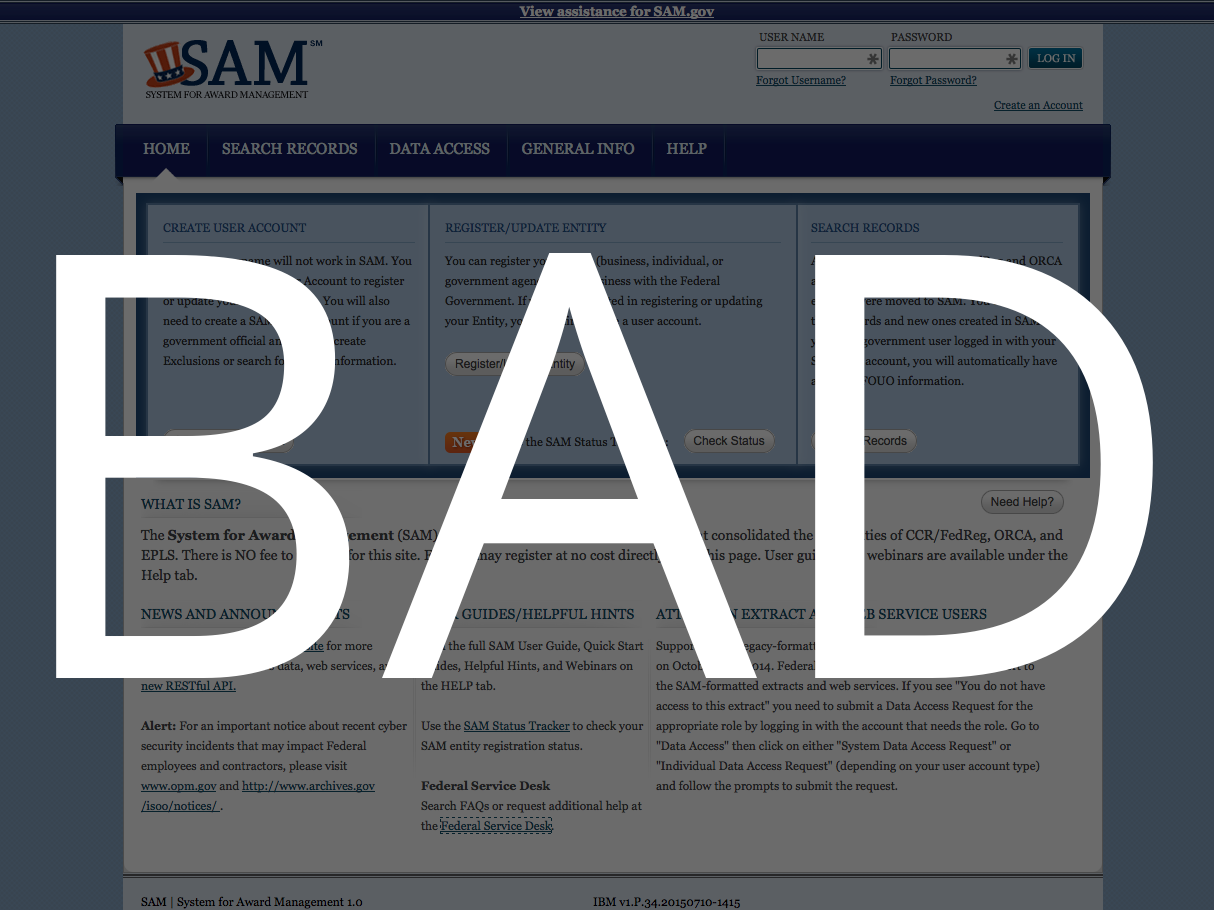
I was delighted that one of my favorite new podcasts, Reply All, spent an episode in August all about horrible government websites (see Sam.gov as prime example 1) — and how they got that way.
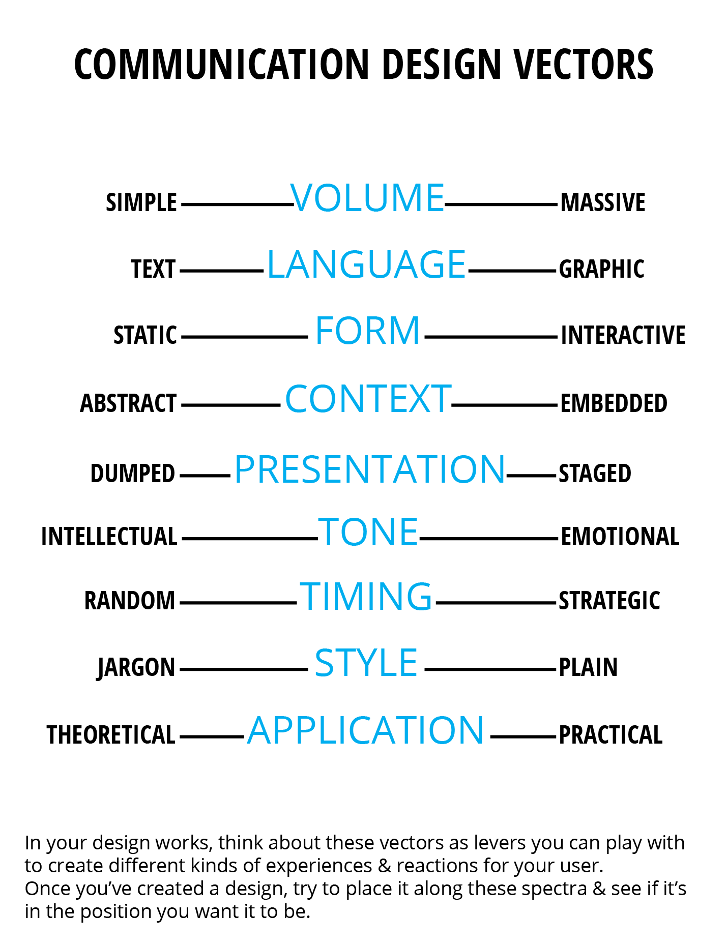
When we talk about terrible websites, it’s not just that they look like they’re from 1999 (though that’s definitely a part of it). It’s also that the processes are burdensome, unclear, and made even more so with bad web experience and interaction design.
The podcast goes into the regulatory environment around procurement and IT, that leads
- to bad purchasing decisions (not enough young, cutting-edge vendors can make it through all the requirements and procedures to submit a bid),
- to out-of-date tech (the yearslong lags between RFPs and roll-outs),
- to dysfunctional govt-vendor relationships (not enough of the right kinds of requirements or metrics to actually lead to usable, useful sites — or to coordinate the many sub-contractors into a unified project).
All of it adds up to hugely expensive sites that are not usable for the target audiences, and that aren’t flexible enough to adapt to changing times’ standards of what good, trustworthy, engaging, confidence-inspiring websites look like.
This certainly isn’t just a federal government agency problem. The same bad-outdated-confusing website criticism applies to most every court website I have experienced.
Now my question is what kinds of regulations & organization structures need to be changed to get courts to make better purchasing decisions — that could make for more agile development processes, that mean more guarantees of interfaces & tools that the users can actually use, and that are flexible enough to stay current easily.


3 Comments
[…] Sourced through Scoop.it from: http://www.openlawlab.com […]
This seems to be a global problem, and not limited to websites but an issue with public sector IT systems in general. The most significant exception that has been quite successful in widespread deployment of good design principles I can think of is the gov.uk initiative, and of course there are individual bright spots elsewhere as well.
I think the main reason is that government agencies don’t have IT design and architecture as one of their core competencies and so are at the mercy of consultants and vendors with more or less hidden agendas to sell whatever best works for them (rather than the end user). This is made worse by being stuck with the waterfall model for project management because of a real or, more typically, just a perceived legal requirement to do things in public procurement the same way they have been always done. (For example in Finland, the common assumption is that procurement legislation stands in the way of agile development, but this is in fact not the case. It does however require some creativity from the buyer.)
Court websites are truly abysmal.
Every single one is different, even those running on the same underlying software.
Amazingly few of them are linked up, so a lawsuit filed in one State will not be known in another(excluding Federal).
Premonition has gathered the World’s largest legal database.
Bigger than every major legal database combined.
One search covers all courts.
Premonition is an Artificial Intelligence system that mines Big Data to find out which Attorneys usually win before which Judges.
It is a very, very unfair advantage in Litigation.
Follow us at https://www.linkedin.com/company/premonition-analytics
for insider legal news and visit us at http://www.Premonition.ai