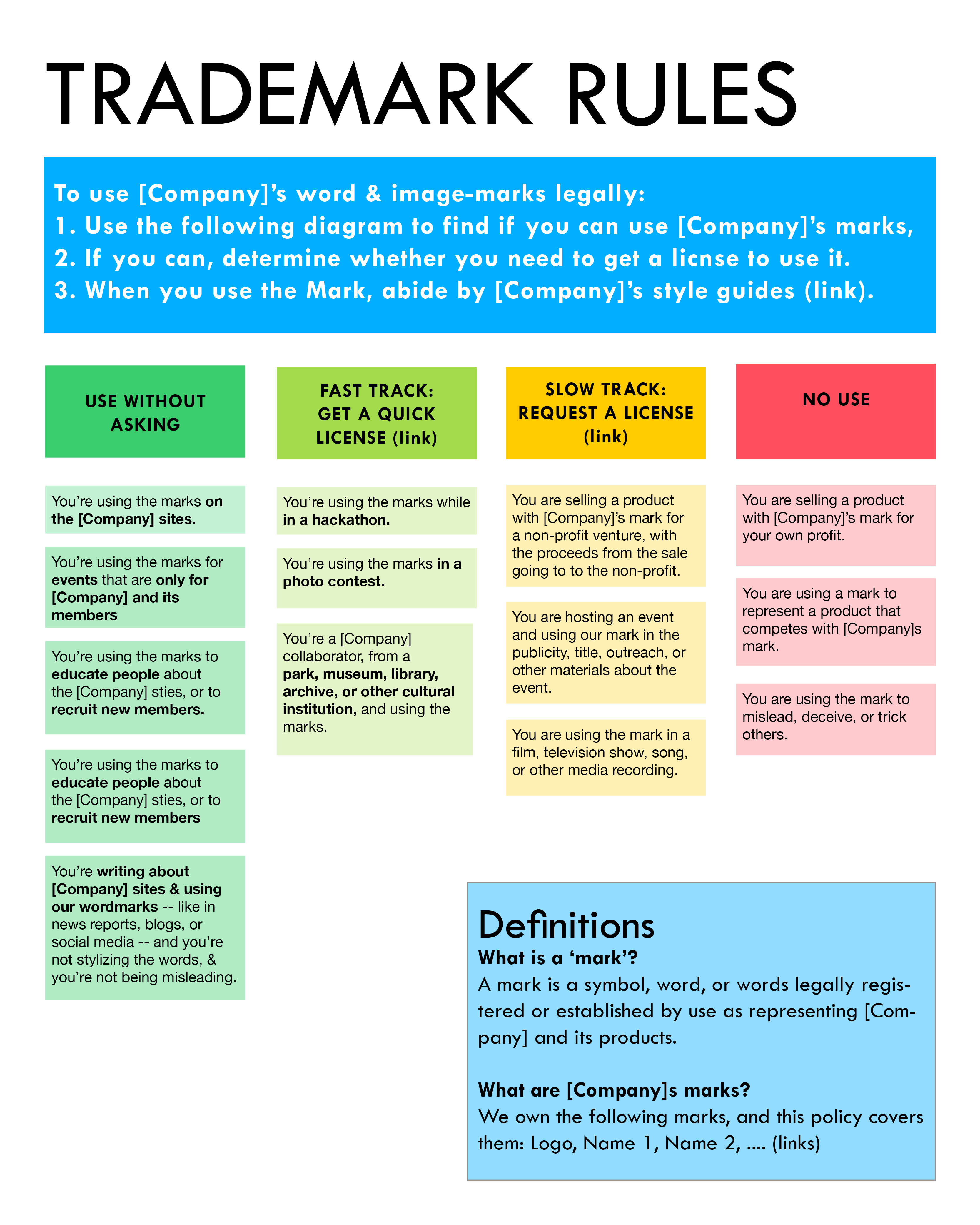
Here is a legal visual that I had started to create a few years ago during a Legal Design Jam for Wikimedia’s trademark policy. Here I’ve made it more generic — the point isn’t to capture specific policy points in this visual, but rather to draft what a one-page, usable guide of a policy might look like.
You can see a few design choices I’ve made here:
1) Give color-coded swimlanes of the possible actions the user can take, linked with scenarios that tell her which path best fits her situation. These are the heart of the design — and given the most prominent design in order to draw the user to them & get her taking this diagnosis step asap.
2) An orientation ‘key’ in the right-hand corner, that will clarify any of the legalese used in the rest of the text
3) A bold title & short list of instructions on how to use the document. Even if they are first on the page, I expect most people to read this third or fourth in their engagement with the document. It should support her in figuring out — am I using this, understanding this document in the right way?
4) Have action-oriented links embedded into the document. As the user decides on a certain course of action, or wants to know more information about certain points — say, like what the style guides are, or what exact marks are covered by the document — she can go directly to this information in full.
The goal of this design is not to just present a more visual & exciting version of a text policy — but to enhance its usability as a decision-making tool.
Please let me know your thoughts about this design — and if you’d liek to adapt it to your own work and documents, please be in touch!


