What would a good management system look like, for courts to assess their workflows & performance? James McMillan, John Matthias, and Matt Kleiman of the National Center on State Courts has a proposition — to use dashboards with lots of visual power to create a better way to see what’s really going on in a legal system & to make smart, data-driven decisions about what to do better.
In May they published Court Case Management Systems Part 17: Dashboards in the Court Technology Bulletin.
Here are some excerpts:
“Data-driven decisions” is a phrase one hears almost daily. And why is this a major theme for our times, you might ask? Because it simply works. Examples are abundant in sports such as in auto racing, where millions of data bits are captured per second resulting in higher performance and much greater reliability, while pushing equipment to the edge of its capabilities (the same can be said for our daily passenger vehicles as well). In another example, Matt Kleiman, our colleague here at the NCSC, explained to us how data feedback allows him to train smarter for his favorite sport, road cycling. And we would guess that many of you have read the book “Moneyball” by Michael Lewis.
It explained how metrics transformed a downtrodden baseball team into a winner despite going against all “common sense.”So the point of this article is to question “common sense” or “collective wisdom” in our courts and to look for new ways to use, and in particular, display the CCMS data that most systems have (or should have) to better manage their operations.
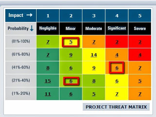
One useful type of management display is the Heat Map:
Therefore, dashboards warnings should be displayed when an anticipated work/ task activity does not occur; or when the work tasks are not be completed on time by unit or individual; or when a case is about to exceed the CCMS tickler setting. An example of how this can be graphically displayed is with a “heat map” example below.
A court version of this heat map would perhaps have the X axis as the case type or case track, and the Y axis as the case status or age. The heat map graphic would be available by court/ judicial division so that a 3-D roll-up and drill down could be possible. In other words, it would be nice to be able to immediately react to problems that have manifested themselves before they become critical.
Another heat map example shown below is interesting because it could reflect size of the count by the length of the column bar. And clicking on one color on the bar could display additional detailed count information.
Lastly, this blog page shows several stock market heat maps that were updated in “real time” during the US stock trading day. And, as was suggested in the chart above, if one clicks on one of the stocks displayed, one can see the current price, statistics, and trends. Some of the ideas presented here might also provide some inspiration for future CCMS design requirements and/or development.
In this example the size of the boxes could correspond to the case count and the colors to the overall “health” of that caseload segment compared to the standard set by the court. It can be used to show cases that are consuming significant time and resources (number of filings, hearings, trial days). The chart could be used to monitor probation caseload or domestic relations matters under court supervision. And this chart could be used to compile data for an individual judge, probation officer, social worker, or teams of individuals.
Another type of display: the Gantt Chart. This sequential layout of tasks & dependencies can more clearly capture the processes at work.
Regarding caseflow management, a dashboard can be used for tracking a particular case against the following measures:
- Case processing time standards for that case type or case track
- Performance measures of cases of the same type or case track – case clearance rate, case processing time, case backlog (snapshot), trial date certainty
- Norms of continuances for that case type or case track
Combining these into a dashboard is both possible and desirable. However, to this point we have not seen a graphical approach that really reflects caseflow. So that brings us to our “big idea” that adapts case processing time standards and applies them to the concept of the Gantt chart from project management and, in turn, applies it to a future case management dashboard.
As shown below, we made the simple Gantt chart that identifies the different time standard “tasks” along with the time allocated to them beginning from case initiation:
So in this example, a civil matter (line ID 2) would start at filing. The filing date is shown graphically as a diamond or “milestone”. The next bar (line ID 3) shows that this court normally schedules 5 days to serve the defendant, and allocates the next 30 days to prepare the defendant’s answer, and so forth. The arrows between the bars denote a dependency on the prior task being accomplished before the next task is undertaken.
The next example below shows how a task can be added to the chart (ID 7 – Discovery Extension) and the dependencies in turn adjust the later tasks.
Finally, shown below is an example of how the Gantt chart could display a delay in the caseflow as designated by the red “squiggly” bar.
while the above Gantt chart concept is good for an individual case, it isn’t adequate for, say, a judge’s entire caseload. In project management a group of projects is called a portfolio. And portfolio management has its own set of goals such as prioritization, managing contingencies, and maintaining response flexibility. Sounds a lot like caseflow management, doesn’t it?
So for the caseflow portfolio graphical display we can look at a couple of possibilities.
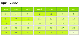
1. Calendar caseflow portfolio display. As shown in the graphic below, this month is all “green.” But one can imagine a future month when many cases, because of delays or other reasons, have turned dates red as a warning. And of course one could click on the date to see the reasons for the warning.
2. Judicial Warning Grid. In this scenario the cases for a judge would be grouped by case type and status as shown below (please note that the status types and numbers are an example and not a reflection of a real system).
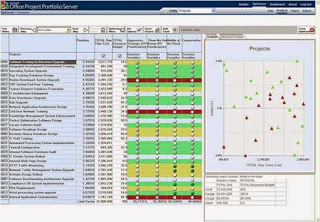
3. Overall Court Caseload Portfolio Management. A graphic that shows the now discontinued Microsoft Portfolio Management system display. We believe that there are ideas here that could be adapted for an overall court caseload dashboard building upon the graphical reports shown above.


