Inside Stanford Law School, the Stanford Securities Litigation Analytics project is gathering all kinds of data about securities litigation & then making it visual, interactive, and usable to lawyers and companies.
It takes a data-driven approach to how we assess the prospects of a case & what kinds of choices and changes a lawyer or litigant can expect when approaching a potential case. And it puts a visual-rich interface on top of this data, to make it clearer and more usable to lawyers and companies in their assessment of a (potential) case and convey it to their own audiences.
Here is a blog post from Jason Hegland (one of the leaders of this project) from last year, about their data visualization (the full article here on their blog: Data Visualization Samples)
today I’m here to present some cool (we think) data visualization ideas and solicit feedback from our readers. For fellow geeks in the audience, our developers will be working within the D3.js and NVD3.org libraries of data visualizations. Please note, these graphics DO NOT feature any real data of any real kind, but are simple drawings with completely made up data and case references. PLEASE don’t reference these charts for any actual insights into securities litigation or details of any specific case. So, with no further ado –
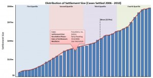
Settlement Distribution Chart
The idea behind this graphic is to allow users to search for a sample of cases (based on any number of criteria), then graph the distribution of settlements within that sample. The background of the chart help to delineate settlement sizes by quartile. In addition to the quartile ranges, a line is drawn to show where the mean settlement value falls within the distribution of cases. Each bar represents a case within the sample, and rolling over any bar provides a snapshot of information about that one specific case. Clicking on the bar will bring a user to that particular case’s page where more detailed information about the case can be discovered.
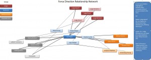
Relationship “Force Direction” Chart
This chart is my personal favorite. Not only does it look really cool, it quickly conveys an enormous amount of information. In this example here, we compare the relationships between 4 groups – judges, settlement mediators, lead counsel and defense counsel. By hovering a cursor over a single “node”, say the mediator Leo Papas, all of his connections are immediately highlighted. A user can see that Mr. Papas has mediated cases before 3 different judges and worked with 3 different defense and 3 different plaintiffs firms in the past. By actually clicking on his node, a list of cases will pop up on the right side of the screen that shows which other entities connect with Mr. Papas in a given case. Clicking on one of the cases listed will direct the user to that case page.
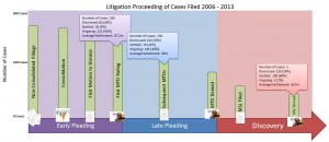
Litigation Proceedings Chart
This chart shows the number of cases that reach into later and later phases of litigation, with all cases starting at an initial complaint being filed, and the numbers growing smaller and smaller as a case progresses. Each bar represents an important moment in the litigation process, such as a motion to dismiss being filed or a ruling on a motion for summary judgment. Hovering the cursor over a given bar will pop up breakdown of case status to that point in the litigation proceeding, as well as an average settlement value for cases settling in that range.
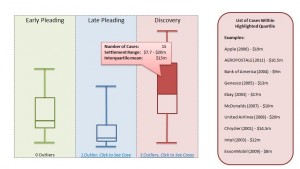
Settlement Distribution Box Plots
Box plots are another great way to visualize the distribution of settlement sizes. Unlike the first graph, the box plot can show those distributions across an additional axis of data. In this example, distributions of settlements are compared across phases of litigation. Other comparisons may include allegation type, parallel SEC vs. no parallel SEC, IPO / Secondary Offering / Non-IPO cases, etc. To address issues with scale, outlier settlements would be omitted, but a link would be provided at the bottom of each plot to display those omitted outliers. Each portion of the box and whisker can be highlighted to show aggregate data for the cases falling within that quartile, as well as a list of those cases appearing on the right side of the screen.
So those are our current ideas. Since each chart requires some amount of web developer time to code and deploy within our web framework, we welcome an feedback so we can target the most useful or most desired charts first. Additionally, if there are any tweaks you can suggest, those comments would be most appreciated!


