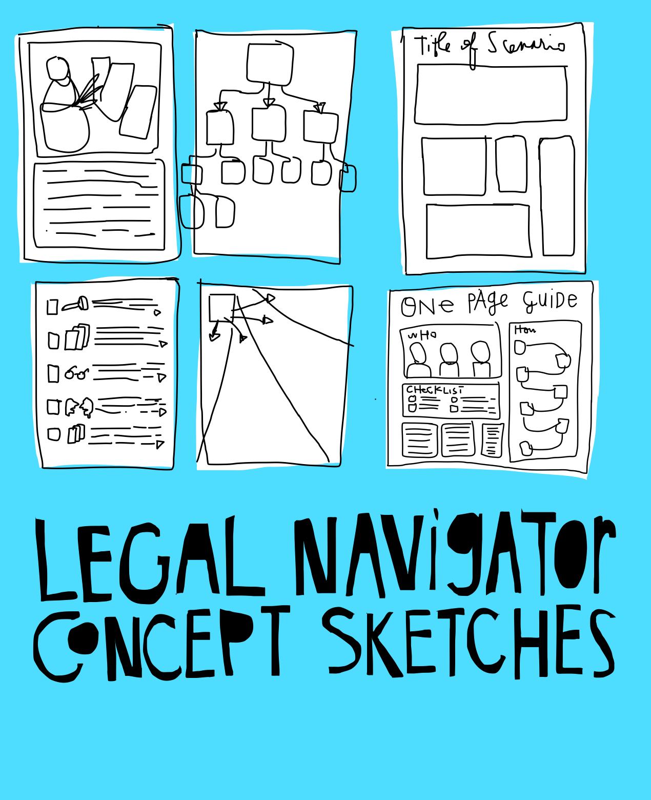
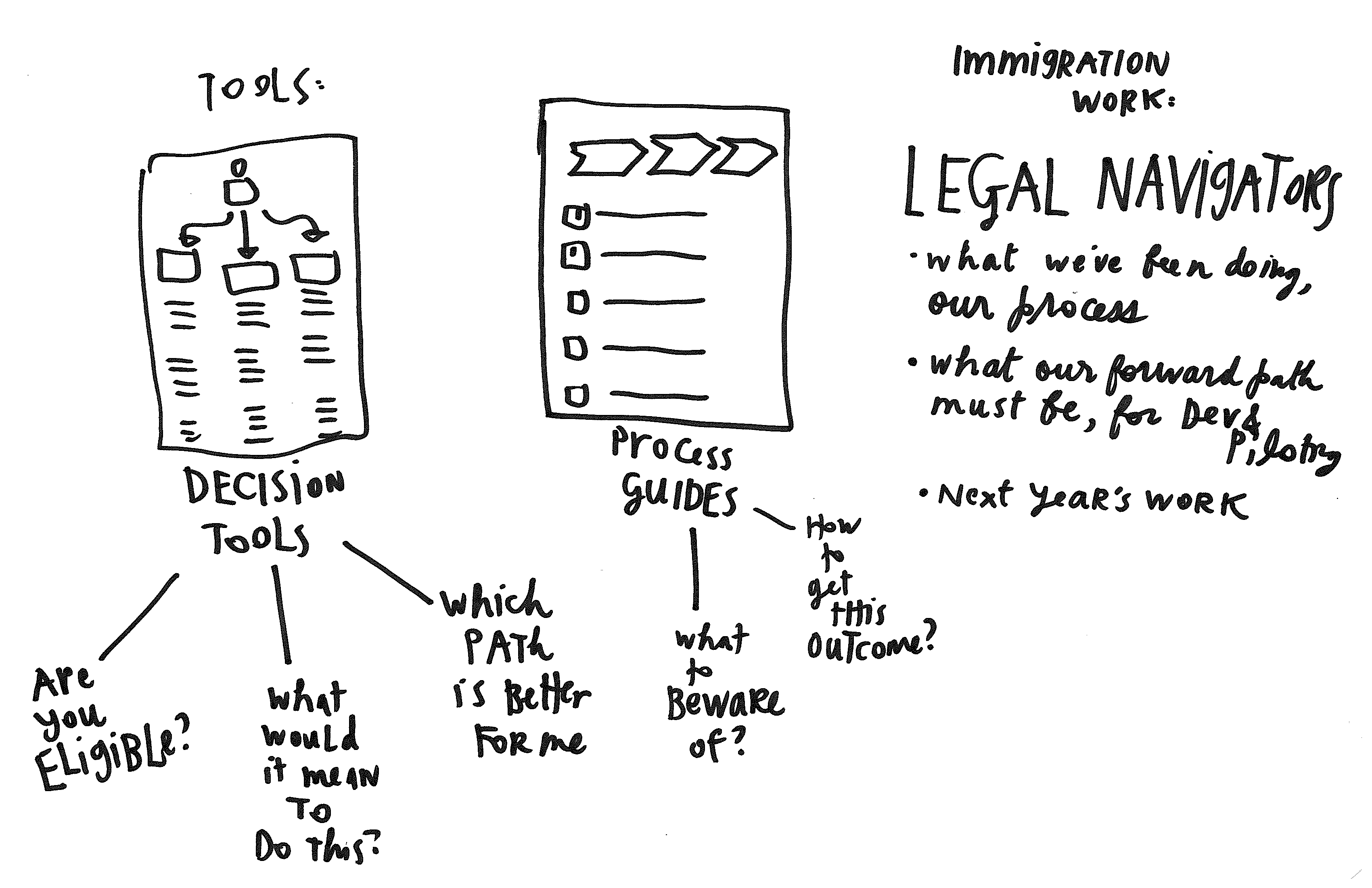
One of the projects on my front-burner is getting a great legal navigator built, that takes a person step-by-detailed-step through a legal process. Here are some of the sketches from my notebooks on how I hope to actually lay these out on a webpage and/or printed page. Composition has turned out to be a fun but non-linear design challenge. How to lay out lots of complicated steps thoroughly, but without overwhelming the user? You can see some of my rough initial thoughts here in my sketches.
Legal navigator concept sketches
- Post author By Margaret
- Post categories In Access to Justice, Current Projects, Project Subject, Project Type


1 Comment
Start with a one-minute video that promotes deep breathing and clicking the pause button as needed. Same with your navigator document, have your readers put some space between themselves and the document as needed.