Last summer, I started a design review of the California Judicial Council’s Self-Help webpage. It is meant to be a central hub for lay people in the state to find legal resources & referrals for their life problems. The goal is that the state court can provide a trustworthy & centralized hand-off to either local, court-sponsored Self-Help centers (where pro per litigants — without a lawyer — can get court lawyers’ help in figuring out the right forms to fill out, and how to fill them out) or to other legal bodies.
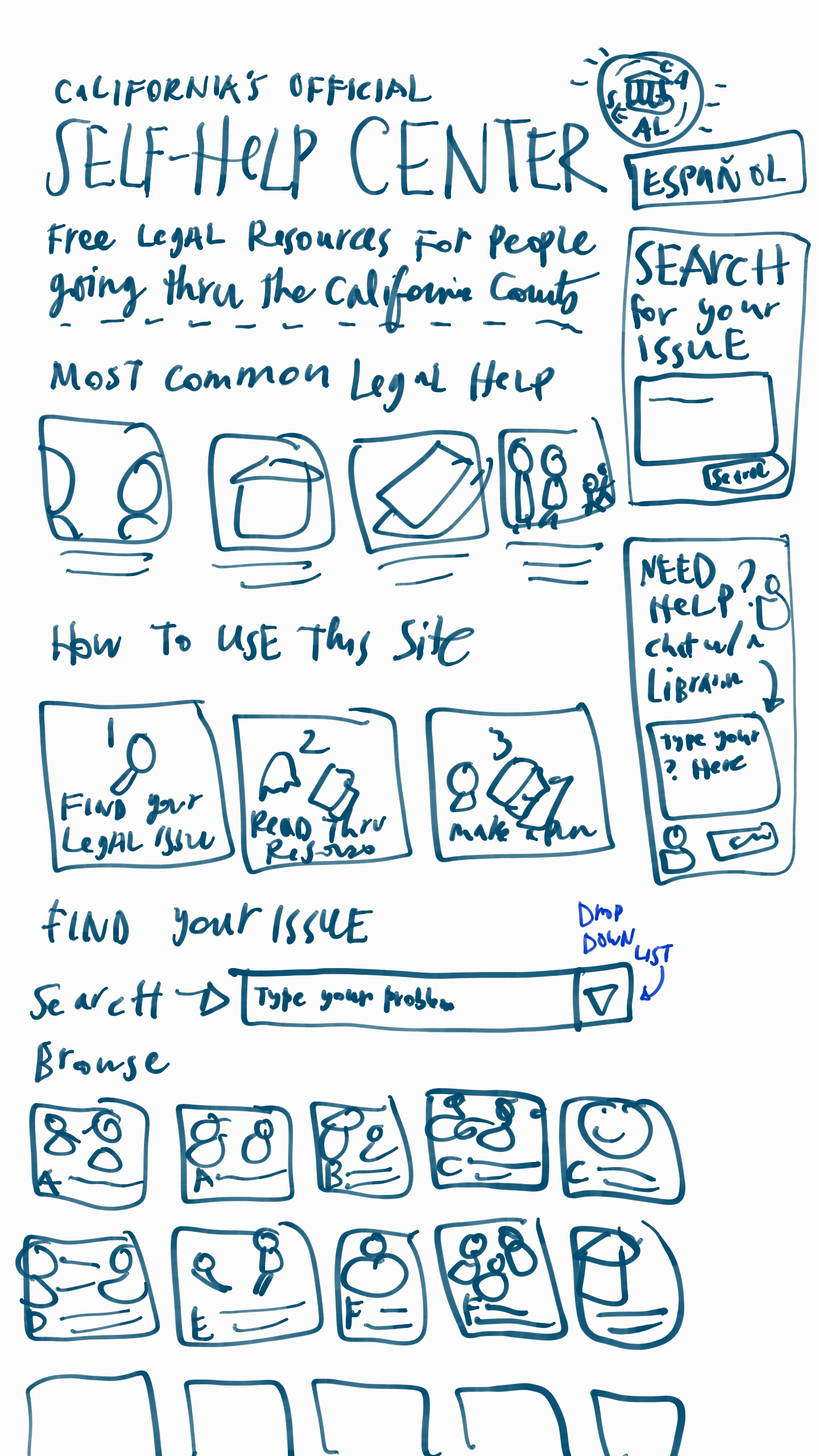
So what should this website look like? I’ve been sketching out some designs.
Here are some of the functions that the site should have:
For the Main Content
- A bolder, graphic welcome & orientation message
- Prominent, image based links to the most commonly clicked help pages
- A 1-2-3 storyboard of how a lay person can use this site, what functions it will provide to them (and what the dominant flow through the site will be)
- The full collection of resources organized into chunks, framed around lay people-terms of the ‘legal problem’, and each marked with their own icon (and a search/filter function at the top of this section of resources)
For the Sidebar
- Very prominent search bar — with big text and set off with other bg color — and perhaps 300 px tall
- En Espanol in larger text
- Reframing the Librarian-chat in a more conversational way, with a sample question in gray
- Reframing the map in a conversational way — around the question of “Where to find help”
Apart from these specific functions, I’ve also drawn up some more general User Experience/User Interface guidelines for those designing online legal portals, like this self-help site.
CHECKLIST 1: SIMPLICITY & GUIDANCE
Orient your user immediately as to what path they may want to take. Present a roadmap that orients them, that lets them see what you have on offer & where they may want to go. Anticipate what they will likely need & tell them the pathways to get the information & tools to get them there
Give relevant Entry Points to your site’s resources. Present scenarios or personas as entry points. First present the most basic possible pathways (likely, categorize the type of legal situation you’re dealing with, choose a ‘type of law’ path).
Build a Clear Hierarchy: Present information in a clear, thoughtful hierarchy. Only disclose what is necessary at that moment. When you do present it, make sure it is presented with clear logic & rationale.
Do not present long lists of resources. Present resources in categories based on answers to specific questions (how to solve this need? how to accomplish this task?). Do not present alphabetic lists. Categorize and group them. Present indexes based on how your user understands her problem, names her problem, categorizes her problem. That is not usually be the first letter of a term for the problem — a term she may not even know.
Stage information. Present very limited information in the first place, with a limited set of options that the user can pursue — and gradually uncover more specific, in-depth information she is seeking out. Have a comprehensive set of information on your site, but do not present it at first. Let the user unpack it if she wants it. Otherwise, give summaries, shortcuts, headlines, and other ways to digest main points without having to spend time reading through comprehensive explanations, lists, options, etc.
Be consistent, be familiar. At each step, have a consistent template of information you’re providing to them. Borrow these patterns from other dominant services and products in your area. Put your user at ease so they know what to expect, where to find things, how easily to scan & shortcut through your material.
Create a Dominant Flow-Pathway. Have a path of least resistance, especially for the new user and the naive user. They want to just flow through process in the quickest, least thoughtful way possible (the ‘No-Brainer’ mode). Make it easy to stay on path — don’t give lots of other options or pathways when they’re on a path. If most of your users are naive to the experience or content, then rein them in. Give them more of a single-use path, that lets them accomplish a task with very clear & strict direction from you.
Give Shortcuts: Especially for expert users, allow them to jump off your dominant flow-pathway. Give lots of shortcuts to find the right bit of information for the user who is coming to the site ‘with a bullet’. Right from the first page, let the user go to the Specific Tasks that she wants to accomplish, through a search box, an index, or a common-shortcut list. Don’t lock your user into the dominant-path. Do not make them feel trapped. Let the user ‘Off-Road’, wandering farther afield, to dive in more, to try things out, especially if they are in expert mode and want something very specific. Give these off-roaders the ability to undo, reverse, and go back to the home-path.
Use white space, do not crowd: space out all of the resources you are providing. Add icons and pictures to flag different categories, tasks, path-entry points. Do not crowd pages with lots of text and options.
CHECKLIST 2: USER-FRIENDLY CONTENT
- Architect your resources into an integrated system. Take a step back to look at all the resources you want to offer to your users, and organize them into a coherent flow of content. Sort & categorize it, cut repetition, and find where you are missing resources that you need to collect.
- Unbury your materials out of PDF and Word documents. When you are presenting legal documents, forms, resources, or otherwise to your user, present them whenever possible on your website, in html, and not as an attachment in another file format (most common culprits: the links to the .pdf download or the .doc download). Take it out of these other formats and lay it out into the flow of your site. If the material is meant to be filled in by the user ( like a form) or printed off (like a training manual) then give them the option to download the .pdf or .doc — but always present it live on your site first, and give the user a clear way to download it in the non-html format.
- Only use the plainest of plain language. Rewrite your existing resources into terms that are meant for the layest of lay users, even when your target audience is very well-educated & familiar with law. Take out all jargon, or define it immediately & in simple terms if you must use jargon terms.
- Make your knowledge visual, graphic, and easy to look at. When you can, transform your text into (or add to your text with) icons, photographs, diagrams, cartoons, and scenarios. Even putting a face on each page will help your user pay attention & relate to the content better. Particularly when you want a user to pay attention to a piece of content, put an image with it.
- Convert long paragraphs into digestible formats. Big chunks of text will induce gloss-over & misunderstanding. Break them apart intelligently & strategically. Use as many checklists and bullet-points as possible, so that the user can designate individual steps and concerns easily.
- Keep your content Up-To-Date & Correct. Do not let your information go to seed. Keep pruning. Remove resources that are out of date. Check back with contributors. Recruit new donations. Recruit updates. Users will tune out from your resource as a whole if even part of your resources contain faulty or irrelevant information.
- Ensure your site is mobile-friendly. What does your site look like on a mobile phone? Make sure your site is responsive to the screen size, so the text & containers all change size for optimal phone experience!
CHECKLIST 3: INTERACTIVITY & RESPONSIVENESS
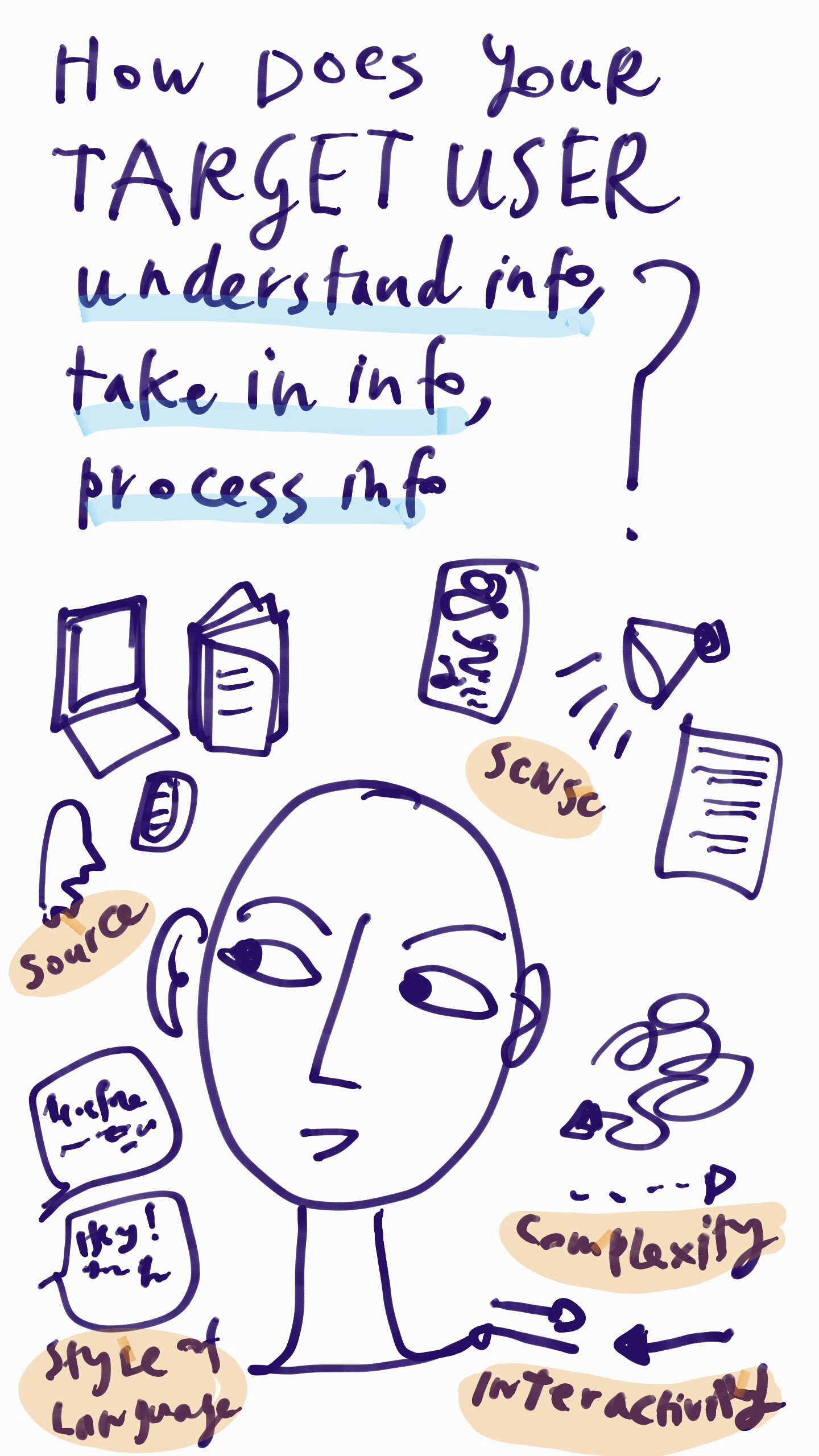
- Allow for multiple modes of interaction. Give users multiple ways to get their intended task done, based on their user preferences. Like, some may want to browse to find the right thing and check it out; others may want to search through query to get right to an answer for their query.
- Give rewards, sense of achievement. Let the user check things off, feel they have progressed, be rewarded by the interface for having got through material. Provide immediate reactions when a user has taken a step, so they know it has registered & they feel satisfied that it is done.
- Make the possible interactions direct, clear & limited. Make it very clear to the user at each page/section/step what they should be doing— and what the effect of their actions will be. Give clear tips for each possible action the user might take. Give one screen per goal. Don’t crowd with too many functions or tasks, make it clear what the goal is.
- Reduce the number of clicks. Let the user stay on the same page for as long as possible, but stage & selectively reveal/hide the information on the same page. Put in enough details for a person to know what they’re clicking on (don’t make them click for them to find out what will be at the link). You can use hover to give the details without a click. Also try to avoid too much scrolling, closing, clicking…
- Once a user has made some choices, give Targeted & Bordered Resources. Once a person has chosen a certain pathway, then you know which specific area of your site that she wants to be in. Wall off the other resources on the sites from her, so that she doesn’t accidentally cross over into another area that doesn’t apply to her. She can come back to the home & restart her search if she wants to enter another area of resources.
- Give Status Mechanisms to keep users aware. Tell your user if there’s been a failure, if conditions are changing, what the status of a process is, when things are being saved, what can be done/undone.


