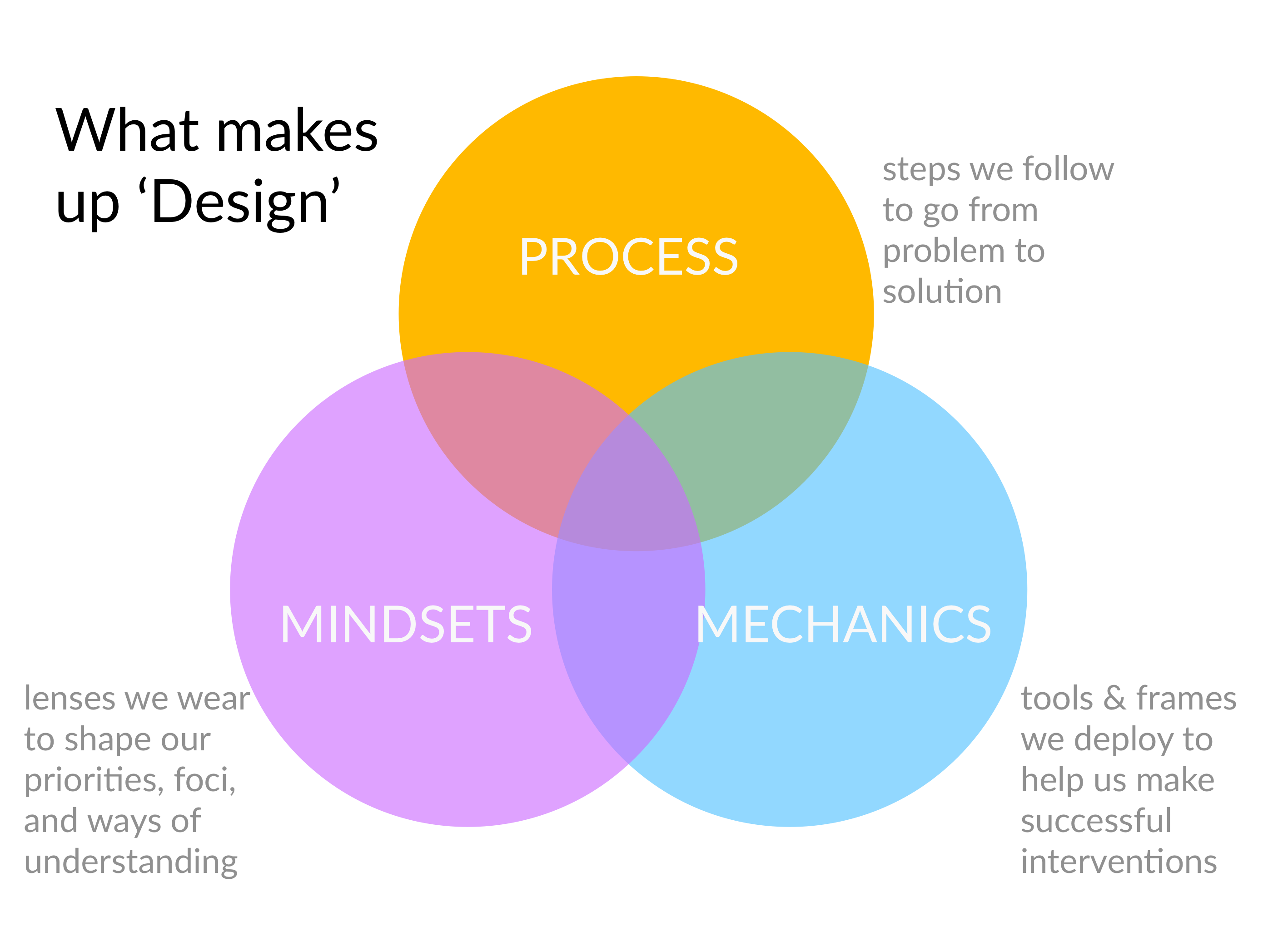
 As I’ve been writing up my ‘Design for Lawyers’ book & preparing my class presentation — I’ve been forming this venn diagram in my mind. Before, I would always explain ‘Design’ as composed of process and of mindsets. Now I’m adding a third main group — Mechanics.
I’ve been struggling with what to do with all of the information & feedback I’ve gathered from my own design work, team projects, and design sprints/hackathons. That’s why I needed a third group — somewhere to account for the insights, patterns, powerful interfaces, successful nudges, and other ‘shortcuts’ to get to a successful design.
I chose the word ‘Mechanics’ to capture this because it’s about the inner-workings of what you, the designer, put into your concepts and prototypes to make them richer, more engaging. Its what has been missing from many of the design classes I’ve taken in the class, where instructors teach the steps to follow through the design process and the mindsets to inhabit — but they haven’t taught students ways to produce a ‘good design’ (other than trying to be as creative as possible in brainstorming, and testing with users to see if you’ve got something that resonates).
What I realized as I do my own projects alongside teaching students how to do design projects, is that if we shared our collective insights and begin to think more systematically about what kinds of patterns, interfaces, experiences, and frames work well (especially for this strange niche world of legal products & services) we can become better designers. Now I am playing around with how to formalize knowledge about Design Mechanics.
I’m prototyping out a Legal Design Mechanics page, full of insights, ideas, and other shortcuts to good design work over at my Legal Design Toolbox. Feel free to check out this very rough version & give feedback!


1 Comment
Eureka Experience with Typography
For 20 years I’ve been searching & editing to draft contracts, and more particularly wills & trusts, an elusive quest to communicate better. Language. Active voice. Etc.
Last week, first time ever, I began tinkering with kerning, character spacing etc. I got really bold with white space. Helvetica font.
And EUREKA! Holy crap. I wasted 20 years. It’s a design not a language problem.
Wasted 20 years but I’m ecstatic. I found what I was searching for.
This week two clients were “blown away” with their new trust agreements.
This design stuff is LAW too.