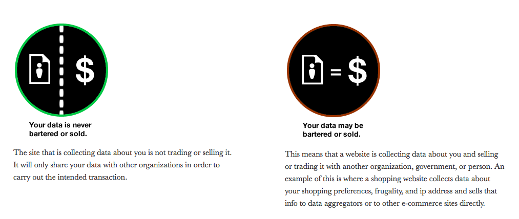
Inspired by the Mozilla/Aza Raskin’s Privacy Icons project, I’ve been thinking about how we can improve how we communicate legal warnings online.

Particularly, I’m thinking of those standard disclaimers & limitations of warranties that legal professionals attach to their websites & their emails. If these consumer-facing warnings are used everywhere, it’s worth thinking of how we can make sure the intended audience actually sees them — and comprehends them.
For one of my research projects, I’m reading through consumers’ complaints about online legal services. One of the trends I’m finding is that consumers easily get confused on sites about what is an official government site/form/process versus what is a commercial site. Even if commercial sites have text disclaimers on their front pages saying, “this is not a government site,” the consumers report in their complaints that they took the site to be an official government site, even to the point of giving their credit card information, before realizing that they were on a commercial site & paying for access to forms that are free on government sites.
My hypothesis, then, is that online legal service providers need to convey warnings, disclaimers, and warranties in more legible ways — ways that will actually attract users’ attention and get them to understand the limits, conditions, and warnings about the legal service on offer.
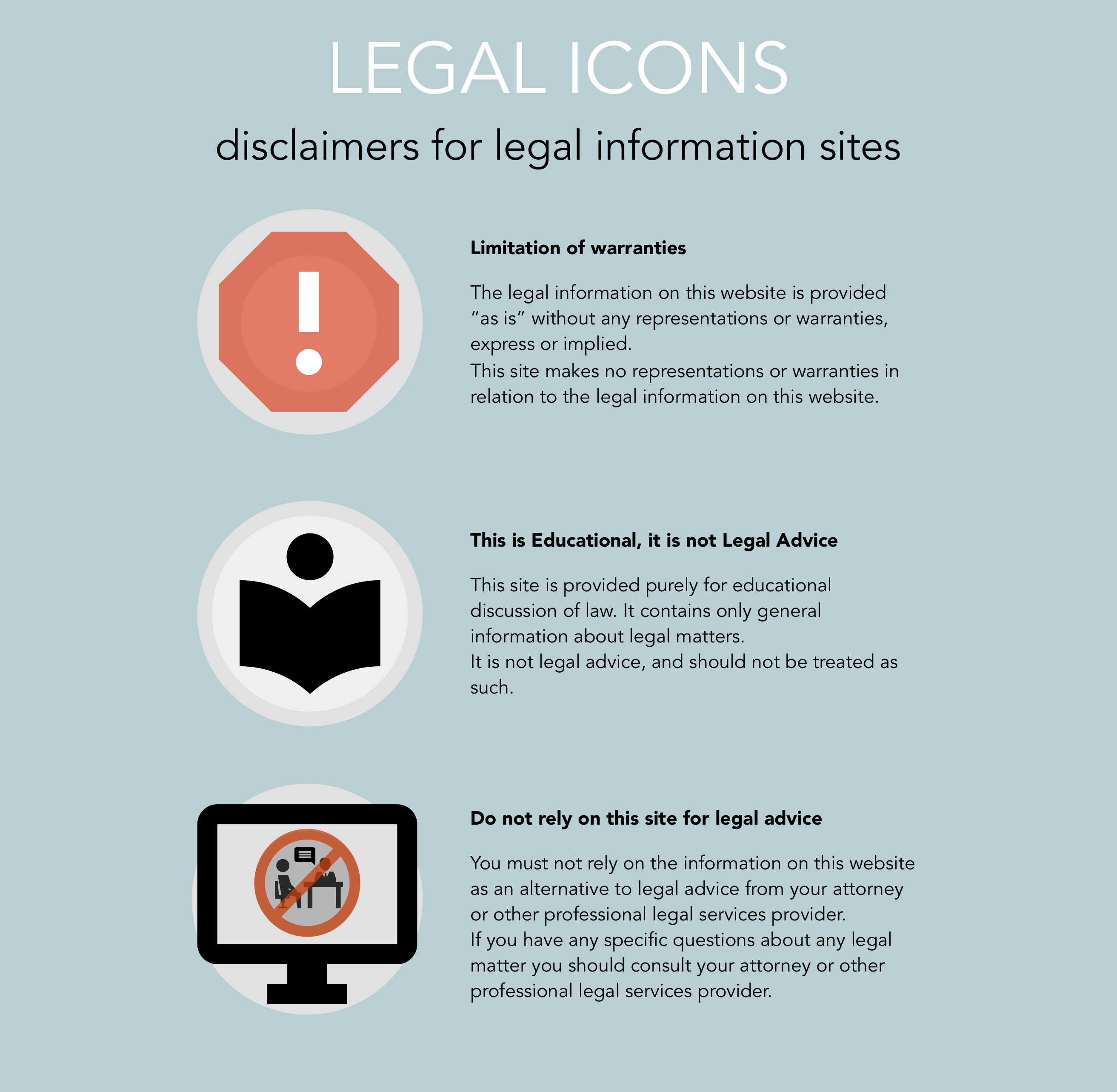
I decided to take a first stab, putting together some quick mock-ups of what some standard icon + text versions of lawyerly warnings would look like. The goal is to get to a set of icons that would be easy to insert in website footers, mobile app pop-ups, and email signatures.
What do you think of these first versions? I was trying to get some images that might resonate, and then supplement with explanatory text.
When I was making these, and then testing them with the people around me, I realize how easily icons on their own can be misread.
The first icon I made to try to convey “This site does not convey legal advice” was read by one non-lawyer I asked to mean “Do not talk to lawyers”. That is a funny message in itself, perhaps a t-shirt to make some money from, but not what I want to convey.
And the icon trying to convey “These is Educational, Not Legal Advice” — I now realize looks more like a Library advertisement (“Read!”) and not exactly the message I want to convey.
The simplicity of icon images is wonderful because it’s striking & seemingly clear. You wouldn’t want a traffic sign with lots of figures, explainers, and annotations. But increasingly I’m thinking that any icon image for legal info needs to have both a headline & an explainer paragraph to be properly effective. Each of those elements plays its own necessary role in the communication with the user:
- The icon grabs the user’s attention, standing out from the rest of the content around it with its color, form & slight mystery ‘what does this stand for?’ or ‘what’s this about?’
- The headline answers the question, telling the user in a broad way ‘what’s this icon all about’ and getting the point across in one statement even to users who are in a rush & only glancing through
- The explainer paragraph gives some follow-up context and reasoning for the message, for the users who want to learn more & be sure they understand
Do you have any thoughts on how to make these communications better? Or what other legal communications we could make icon versions of?


1 Comment
[…] Open Law Lab has a post on whether standardized legal warning icons could increase access to legal information. […]