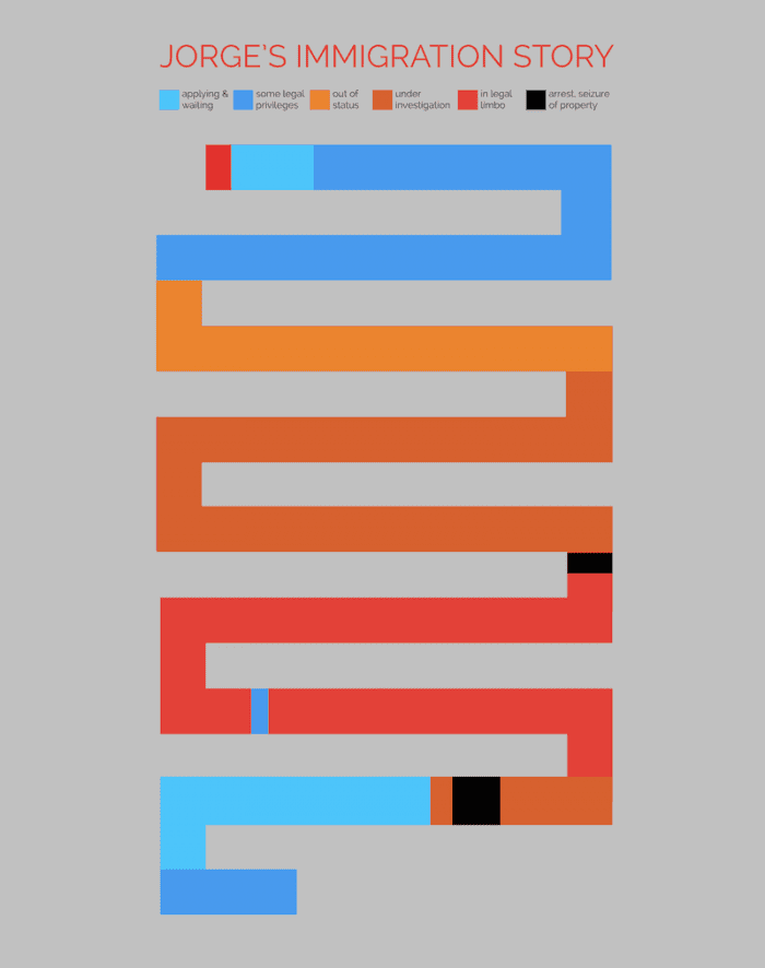
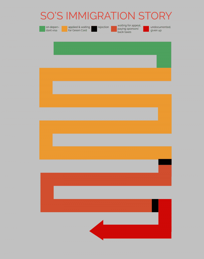
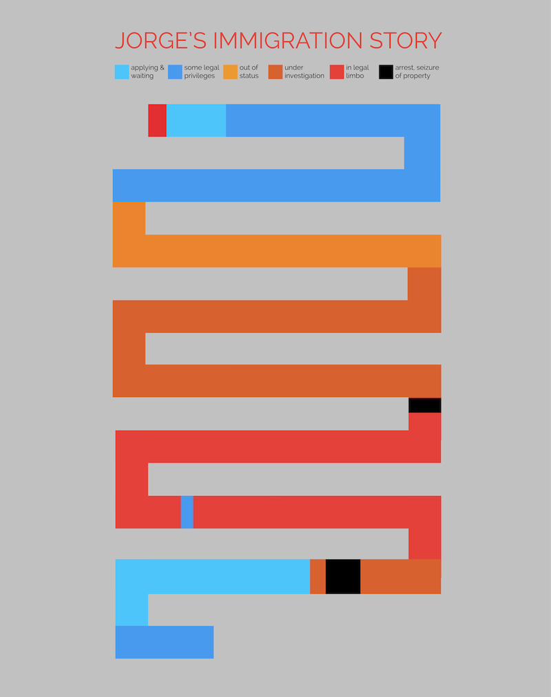
For part of the Fwd.us DREAMer Hackathon the past 2 days in Mountain View, I started prototyping some uber-simple infograhpics of (often crazy) immigration narratives. I wanted to show the amount of time waiting, the amount of time in limbo, and the failpoints. Even if you come in legally, happily, optimistically, you can end up in the red zone — by no fault of your own. Here are three sample infographics I made from simple timelines of 3 immigrants, about their immigration story.
Most I kept super simple, and one I did a follow-up, annotated with the little stories & explainers that went along with the different phases of the journey.
Now I’m building a visualizer app that would let someone enter their own timeline of events, dates & colors, and the app would generate them their own Storyline Visual path.
I’m intrigued by the potential to tell complicated stories through striking posters like these, to both mobilize & educate. Beyond immigration stories, I think there are many other legal-system stories to be told through visual means like these.


5 Comments
great post. Any recommendations on tools to make infographics?
Yes, I’ve started collecting together some infographic tools in the Visualization section of the Legal Design Toolbox on this site: http://www.legaltechdesign.com/legal-design-toolbox/ Have fun!
Hey Margaret: Just finished visiting the noblepaths prototype site. Great job by your team! I was really struck by the different ways that the two path visualizations you’ve used can be applied. The timelines you’ve used on noblepath are terrific for telling a rich individual story, so beautifully illustrated with photos in so choi’s narrative. It’s like a graphical version of the digital storytelling that your bay area neighbors practice at http://storycenter.org/.
But there are limitations to the timeline. It’s much harder to use to pull back and make sense across narratives. I love that the these storylines suggest all sorts of possibilities for depicting stories in the aggregate. The timeline also suggests linear progression, but as the color flow shows so well, these stories don’t move in one direction; they can be circular, or even backwards moving. It would be cool to “map” a city block or set of family histories to discover where the points of commonality are. They would be great as a card set, or even dominoes!
Excellent post, thanks for sharing the info-graphic, the immigration storyline is really nice and informative. Keep on sharing. For more details please visit: http://goo.gl/X4ncmC
Grate info-graphic! thanks for providing the knowledge on Immigration, it help’s a lot, thanks for the information. Keep on sharing. Am always waiting for this type of data.