I just discovered a rich design document & user research study conducted by a team out of Harvard’s Berkman Center in 2010.
It looks at how more access & usability can be built into current civil court processes. And one of its co-authors is Phil Malone, who has just joined Stanford Law School’s team, as director of the new Innovation Clinic.
The report is extremely valuable in the concrete suggestions & insights that it establishes. Any team who is working on a redesign of a court service should read it now.
Or, if you are designing interfaces for lay consumers to understand a legal process or to go through a legal system, you should also take a look at its recommendations.
I’ve pulled out some here, for a quick overview of some of the points to pay attention to.
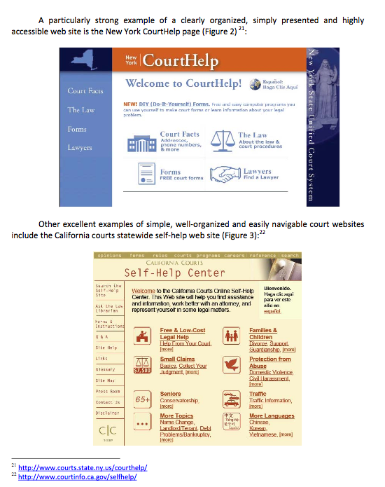
What does a usable interface look like?
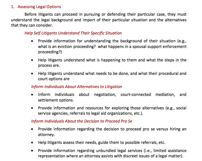
What are the most crucial needs of lay litigants?
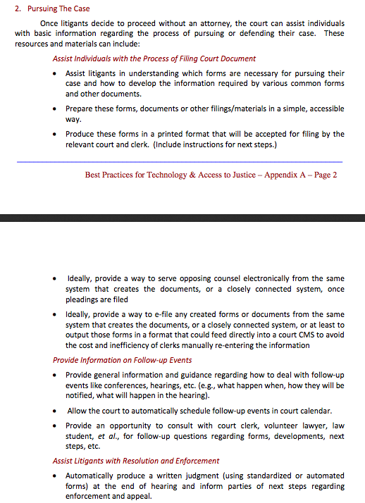
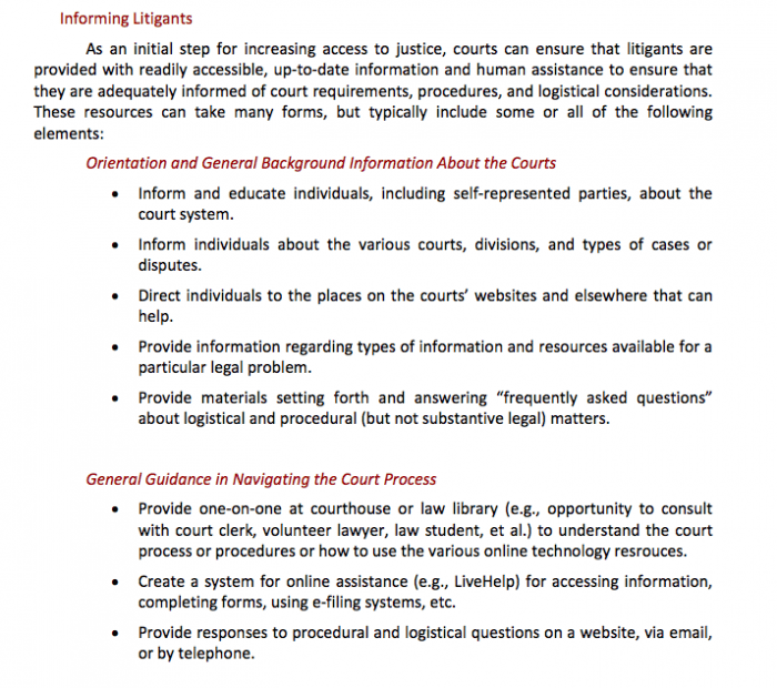
How can a legal service orient & prepare lay people?
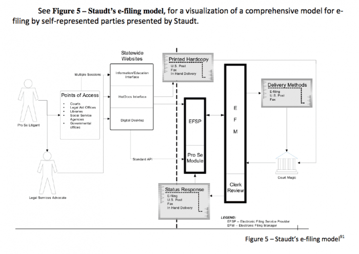
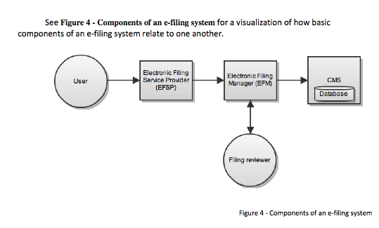
How can electronic systems help lay people to get legal tasks done?


1 Comment
You might also appreciate the white papers on access and tech that came out of the LSC Tech Summit. They were published in the Harvard JOLT last spring and are online here: http://jolt.law.harvard.edu/symposium/