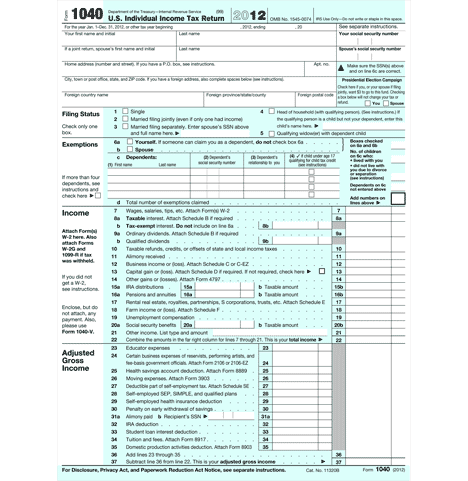
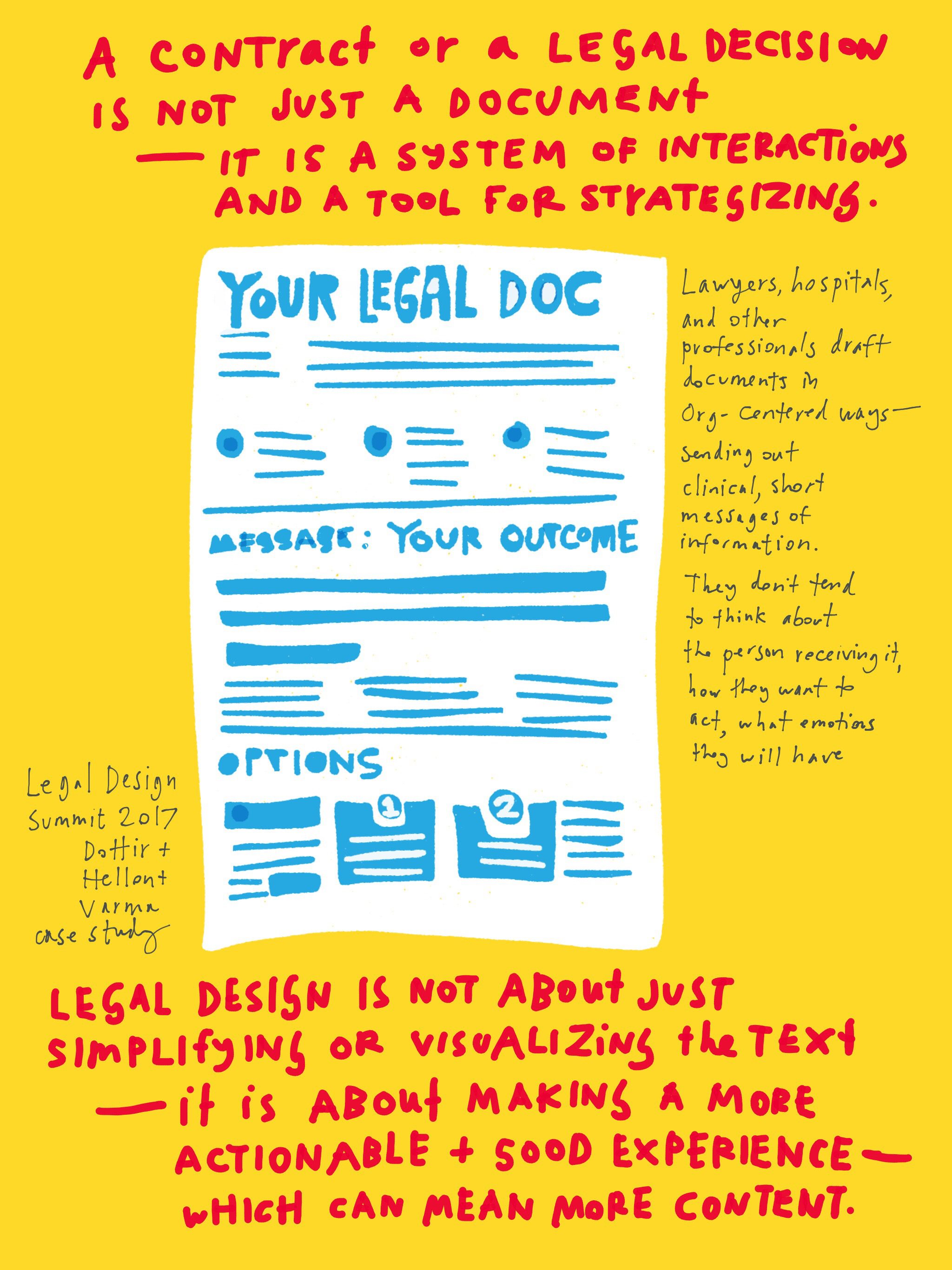
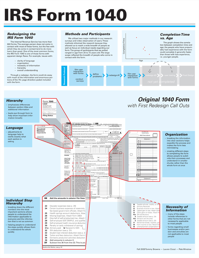
In 2004, Karen Schriver, a designer and professor, took on a Milwaukee journalist’s challenge to make the 1040 IRS tax form more user-friendly. She tackled the redesign with information design principles, using composition and visual tools, to guide the user through. Unfortunately, the link to her redesign is broken — but her writing about the redesign is immensely useful for lawyers aspiring to compose better, more usable legal documents.
Her design wasn’t accepted (see below for why…) but the principles that guided her & how she implemented her ideas, provide useful insight into good information design. Put shortly, here are some of the lessons to be drawn out, when designing interfaces & forms for non-experts.
- Make the instructions and headings user friendly, with conversational language & clear descriptions
- Situate the form into lived scenarios of the user
- Order ideas to be more logical and smooth for the user’s mental model
- Use consistent layout & interaction patterns to reassure the user about what to be doing
Here’s how Schriver described it in a 2005 interview:
The redesign of the U.S. Internal Revenue Service 1040 tax form was both a challenge and an exercise in frustration. Doing it reminded me once again just how hard it is to design for government bureaucracies. It is not my best work, but I am proud that I tried to improve a truly terrible form. The revision is not very exciting or even that visually different, but the concepts behind the design are sound and it lays a better foundation for further revision…
I agreed to revise the tax form after a newspaper reporter from the Milwaukee Journal Sentinel dared me to do it. I accepted the challenge and then he gave me these guidelines:
- No going over two pages.
- No using color (other than black).
- No rewriting or interpreting tax laws.
- No deleting items or questions.
- No funding for usability testing (or for anything).
My goal was to generate a revision that would improve the form’s usability within these constraints by modifying the writing, design, and typography. To do so, I first carried out an expert review. Since there was no time or money to test my ideas with citizens – a really frustrating situation – I simply got to work and did the best I could, knowing I’d have to satisfice. Following is a brief account of what I did in terms of the writing, design, and typography.
Principles of Writing
My first move was to make the writing more citizen-friendly and the language more conversational. My aim was to compose the headings so they engaged the reader personally. Studies show that readers respond more positively to text when they can easily see how their goals can be met if they peruse the macro-level of the text. To help readers imagine how their goals will be met, information designers can use macro-level elements such as headings, leads, or photos that set up a scenario to frame the content. These moves frame the conversation between the government and the taxpayer.
To read more about the design of forms as conversations, see Caroline Jarrett who discusses the UK’s Inland Revenue Service tax forms. See also David Sless who characterizes design as conversation in his form redesign work in Australia.
To revise the headings, I employed the scenario principle, a research-based strategy for structuring prose around human agents performing actions in a particular situation. This meant that in composing headings, I tried to engage the reader personally. Instead of using the heading ‘Label’, I revised it to say: ‘About You’. And instead of ‘Refund’, I wrote ‘Refund Owed You’. In the original form, the only use of the word ‘you’ was ‘Amount You Owe’. Not very friendly. To read about the scenario principle, see Revising Functional Documents: The Scenario Principle, by Flower, Hayes, and Swarts, 1983, in New Essays in Technical and Scientific Communication, NY: Baywood.
A second key concept behind the redesign had to do with logical writing; that is, the order of ideas. Whether writing instructions, questions, or statements, ideas should follow an order that will make processing the information easy for the reader. In the case of the IRS form, it meant making sure the entire question was presented before mentioning exceptions to the main point. In other words, ask the question before qualifying it.
In the original, the government wrote: “Presidential Election Campaign. Note. Checking ‘Yes’ will not change or reduce your tax or reduce your refund. Do you, or your spouse if filing a joint return, want $3 to go to this fund?”
Notice that citizens must read to the end of the second sentence before they can understand what is being said. This places an unnecessary burden on memory. In the revision, I wrote:
“Presidential Election Campaign. Do you or your spouse (if filing a joint return) want $3 to go this fund? Please be aware that checking ‘Yes’ will not change your tax or refund.”
A third key idea was to order the information so that it would be easy to see all questions and increase the likelihood that all questions would be answered. A complaint that the IRS had made over the years was that many people forget to fill-in the item asking for their Social Security Number (SSN). The IRS may think that citizens who don’t fill-in their SSN are ‘trying to pull a fast one’ to avoid being tracked down. From the IRS’s perspective, the SSN is arguably the most important piece of data, for it provides the link to taxable income. Although some citizens might purposefully neglect to fill in their SSN, others may accidentally skip over the question.
On looking at the placement of the SSN question, I noticed two things. First, the item wasn’t numbered. This seemed like an obvious mistake that should have been caught by the IRS a long time ago. After all, if it ain’t numbered, it’s not a real question! Second, the item did not appear in the same visual sequence (i.e. top-to-bottom orientation) as other items. Instead, it was tucked off to the top-left of the form, looking like a band-aid that was added at the last minute.
So I moved the item asking for the SSN and made it question 1. Although I thought this was a rather mundane move, the IRS did not appreciate this revision and said so. They informed the reporter who published my revision that this change would never fly because IRS employees who input the information into computers were trained to look for the social security numbers in the top right position. One can see whose priorities have been deemed of value when the IRS puts the needs of its own roughly 5000 data-entry staff ahead of the needs 57 million taxpayers.
Principles of Design
My ideas for improving the design of the form were simple. I tried to create a stronger left margin so that the questions stood out and didn’t require readers to keep track of a neurotic left margin.
I also used a consistent graphic pattern for signaling the various actions citizens had to complete, such as checking or calculating. For example, in the original, there were five different styles of boxes for ‘checking’ something. The revision uses one style of check box.
Forms often ask people to do things such as checking a box, filling in a number, calculating a total, listing information, or transposing numbers from one place to another. It is important then when readers see one of these types of requests that they know what is going on and what to do. They should be familiar with the pattern for that information type set up through the design. As we all know, consistency is a hallmark of usable information design.
The interview continues at the link, with more detail about typography and roll-out choices.
Another email from Schriver describes the pushback from the IRS to her design:
Within several hours after I turned in the revision, the IRS had a list of reasons why it couldn’t be implemented. Most had to do with the need to “keep things the same.” As Robert Erickson, the government official responsible for the existing 1040 said to the reporter: “Agency employees are trained to look for the information where it now appears when putting the information into IRS computers…. Retraining IRS workers to use new forms and reprogramming computers to accept them would run to millions.”
I argued that citizens were the primary and most important stakeholders for the form. Unfortunately, this argument didn’t make into print; nor did my argument about the need to test the revision with a representative sample of citizens.
Here’s the Milwaukee Journal Sentinel’s coverage, along with responses from various professional stakeholders with their first-gut reactions:
Making 1040s a bit less taxing
Form needs redesign, but it would be easy only in theory, IRS says
By AVRUM D. LANK
alank@journalsentinel.comPosted: April 14, 2004
The 1040 tax form is so deeply woven into the American psyche, especially this time of year, that it seems as inevitable and immutable as Mount Rushmore.
Since 1977, the last time it was completely redesigned, the 1040 has been tweaked only to accommodate new federal laws. Through five presidencies, those changes have piled up, creating a maze of frustration for millions as they struggle to meet today’s filing deadline.
To ease that frustration, the 1040 could use a complete makeover, and that is exactly what the Journal Sentinel asked of Karen A. Schriver. She is an internationally known expert in the presentation of information.
The result is a 21st-century version of the form that is friendlier than the official 1040. Unfortunately, it is easier to overhaul the form in theory than it is in real life, Internal Revenue Service officials say. But they might attempt a redesign for the 2006 filing season anyway.
The trick of a successful makeover is to create a new form that is easier to use but looks enough like the old one that users aren’t scared off by it, Schriver said in an interview. She works for KSA Document Design and Research, near Pittsburgh.
“People have a lot of attachment to what they have seen before,” she explained.
In other projects, she has completely made over forms so they are “definitely better, and users would say ‘it doesn’t look like what it did before so it must be harder.’ ”
Maintaining a surface familiarity is one reason she kept the redesigned 1040 to two pages.
But Schriver’s 1040 features a new typeface, bolder arrows, more consistent typography and lighter grays. It is also friendlier, using the words “you,” “yours” and “thank you” more frequently.
“The only use of the word ‘you’ in the original was ‘amount you owe,’ ” said Schriver, author of “Dynamics in Document Design.” “I thought that was sort of mean and militaristic.”
The changes help, but only so much can be done with the form, as it is based on a thicket of underlying tax laws, several local financial advisers said.
Given all that, “she did a beautiful job,” said Paula Hogan, a financial planner in Glendale. “I wish I could use this form. It is as if she is working with a customer.”
Schriver’s form “is somewhat of an improvement, but it isn’t earth shattering,” said David J. Jensen, a certified public accountant with Walkowicz, Boczkiewicz & Co. in Waukesha who used it to figure several hypothetical returns. “It doesn’t seem to appreciably reduce the complexity of calculating.”
“No matter how you change (the form), you can’t make the tax law understandable when it is cobbled together since the ’60s to include everyone’s favorite tax break,” said Rick J. Taylor, a CPA in the Milwaukee office of Clifton Gunderson.
“At times the law gets in the way” of a clean form, said Robert Erickson, the government official responsible for the existing 1040. Congress rarely considers how tax changes will fit on forms, he explained.
“We always like to get feedback from whatever source,” said Erickson, senior technical adviser for tax forms and publications with the IRS in Washington, D.C. “We’ll certainly look at some of the ideas that are on (Schriver’s) form.”
One is the typeface she chose.
The traditional Helvetica used by the government “signals a lot of bad vibes,” Schriver said. In addition, it does not have high contrast between its regular and bold faces.
Schriver substituted higher-contrast Serifa.
Another big difference is how the instructions are written. When modifying language on the existing 1040, Schriver took care to make statements before qualifying them.
For instance, explaining the line for contributing $3 to publicly finance presidential campaigns, the official 1040 gives the consequence of doing so before explaining the choice being requested. It reads:
“Note. Checking ‘Yes’ will not change your tax or reduce your refund. Do you, or your spouse if filing a joint return, want $3 to go to this fund?”
Schriver’s form asks for the choice first, reading:
“Do you, or your spouse (if filing a joint return) want $3 to go to this fund? Please be aware that checking ‘Yes’ will not change your tax or refund.”
Schriver also moves the question to the upper right hand corner of the form, where the official 1040 asks for Social Security numbers.
Her form asks for the numbers as line No. 1, directly underneath the filer’s name and address.
That layout keeps a reader’s eyes working down the 1040, not across it, making it harder to miss the Social Security question, she explained.
Even such a simple change creates problems for the IRS.
Moving the location of Social Security numbers would make the form harder to process, Erickson said. Agency employees are trained to look for the information where it now appears when putting the information into IRS computers.
“The actual cost of redesign in terms of graphics is not that great,” but retraining IRS workers to use new forms and reprogramming computers to accept them would run to millions, he said.
Schriver estimated that the form makeover she did for free would have cost the IRS about $150,000.
As well, no IRS form is an island – there are 475 of them, most of which are related. Redesigning one usually requires changing others.
For example, Erickson said the IRS is seriously looking at consolidating some lines on the 1040 to save space. However, that information then must be included on existing schedules or work sheets, which themselves would need to be redesigned.
Although about 57 million paper 1040s were filed last year, reworking the tortured form might become increasingly less important as the IRS pushes more taxpayers to electronic filing.
“We are in a time of transition in this area,” said Jensen, the Waukesha CPA. “In the past, I used laser printers to generate tax returns that IRS employees used as input documents. Today, we send the file electronically. . . . Eventually, taxpayers will receive a file listing all of the income, deduction and credit items that have been reported for them. . . . In such an environment, tax forms and line-by-line instruction books will become less important.”
Then there is this idea from Mark Miller, a CPA with Kolb+Co. in West Allis. The way things are going, he sees the possibility of a very simple future 1040, paper or electronic:
“Line 1 – Total Income; Line 2 – Pay it in.”
Both the new 1040 and Design Principles document are copyright by Karen A. Schriver.


3 Comments
[…] via Redesigning a 1040 | Open Law Lab. […]
Hi! I just want to share a good source for 1040 forms just in case someone needs it someday, I found a blank fillable form on PDFfiller, here’s the form I used http://goo.gl/pSm55M.
You can find the PDF of the redesign here https://web.archive.org/web/20060308014917/http://www.jsonline.com/graphics/news/img/apr04/New1040setC.pdf