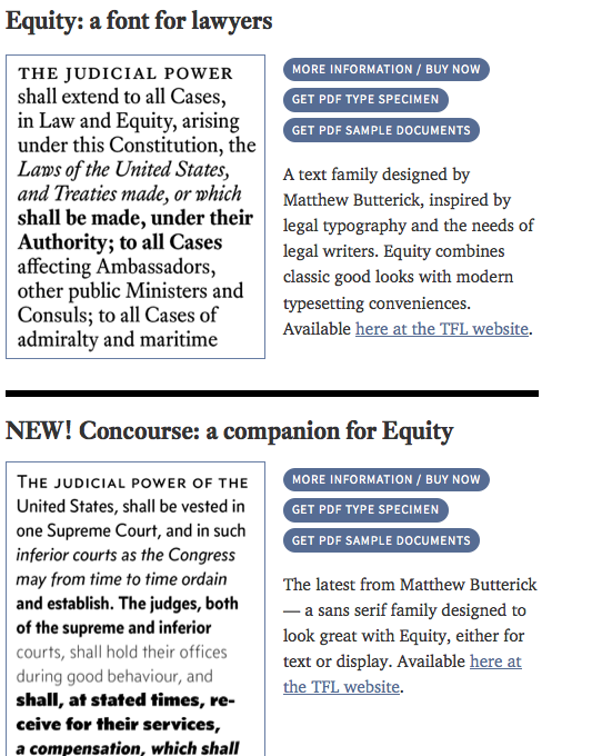
I’ve been enjoying the site Typography for Lawyers from Matthew Butterick.
He makes some effective arguments as to why Typography is more than just font choice — why it is a design choice that will affect how a lawyer’s audience will react to the text itself.
Why does typography matter?
Typography matters because it helps conserve the most valuable resource you have as a writer — reader attention.
Writing as if you have unlimited reader attention is presumptuous because readers are not doing you a personal favor. Reading your writing is not their hobby. It’s their job. And their job involves paying attention to lots of other writing. The judge has not set aside your motion for summary judgment so she can savor it during her upcoming vacation to Maui. More likely, it is just one item in a queue of hundreds, all of which require her attention.
I’ll even go one better: I believe that most readers are looking for reasons to stop reading. Not because they’re malicious or aloof. They’re just being rational. If readers have other demands on their time, why should they pay any more attention than they absolutely must? Readers are always looking for the exit.
Consider an oral argument in court. By the day of the hearing, you’ll have spent a lot of time honing the structure and substance of your argument.
But do you show up to court in jeans and sneakers? No, of course not. You wear proper court attire.
And when you speak to the judge, do you slouch at the lectern, eyes cast downward, and read from a script in a monotone? No, of course not. You change the speed and volume of your delivery. You gesture. You extemporize.
You do these things because you don’t merely want to be heard —
you want to persuade. To persuade, you need to hold the judge’s attention. And to hold that attention, you cannot undermine your argument with distractions.It’s the same on the printed page. The text matters, but if that’s all that mattered, then everything could be set in 12-point Times New Roman. And that would be the equivalent of staring at the lectern. In the same way that good speaking skills matter during an oral argument, good typography matters in a written document.
“But I don’t have visual skills. I don’t know anything about graphic design.” That’s like saying you can’t dress properly for court because you don’t know anything about fashion design. Compared to studying for the bar exam, it’s easy to learn the skills necessary for producing good typography.
Butterick’s First Law of Typography
Given multiple documents, readers will make more judgments based on typography as they find it harder to make judgments based on substance.
Butterick’s Second Law of Typography
Judgments based on substance require reader attention, so under the First Law, readers with limited attention are more likely to make judgments based on typography.


1 Comment
the link to the site to download the font doesn’t work! 🙁 I love them both and would love to be able to get these fonts.