I started typing out a 3 page email reply to a colleague who wants to figure out how to build a website for a legal project she & a team are working on. I realized, I have too much to say & I want it to live on the Internet, with visuals & links. So, it is a blog post now:
So you want to build a website?
I know it is tempting to jump into just buying a domain & trying to learn html to build your dream site — but go through these steps, and you will save a lot of coding angst and and build a product that users will like. No matter how tempting to jump to the pay-off moments of buying a name and publishing a site — stick to this progression of steps — I know it would have saved me on my past projects from many false paths and confused group communication.
With that, happy building!
1. Sketch the Storyboards
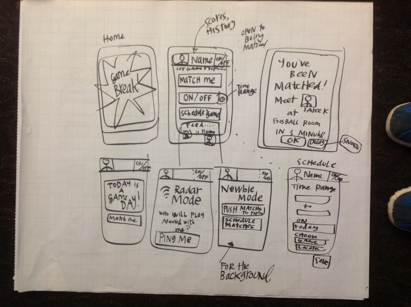
Sketch and draw out all the possible screens that your website will have. It’s like storyboarding for a film, if you’ve seen those kind of things.
This is a recent storyboard of screens for an App, but the website concept is the same. Map out the system, say what goes to where, and what the general flow of the user’s journey should be through the screens.
You should annotate each sketched out screen, saying:
- what goes where,
- what happens when the user presses this button,
- what will be revealed on mouseovers,
- what sliding/animation will exist,
- what the function of each element is
This step will make it (MUCH) clearer what scope of a website you are actually trying to build. You are getting the concept out of words & ideas, into a real, concretized design. This step will eliminate later confusion, what-ifs, and resentments in your group.
This process of sketching out the flow and basics of the site, should put everyone in your group on the same page about what product you are actually building. Visualize the idea, so that you all are actually thinking the same thing. You don’t have to have all of the text & explanations written out now. Instead, just say what type of text would go where.
You are done with this stage when the entire group agrees that this map & flow are good.
2. User Testing 1: Paper Prototypes
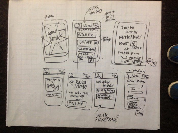
Make a second draft of the sketches of the website screens without the annotations. Then have some test users go through the paper prototype, as if it were a real website.
Perhaps this sketch is a a little rough & messy — but don’t worry about perfection. Maybe you should make the text a little more readable then my scribblings here, but honestly — keep it sketchy, don’t spend a lot of time on color or perfect lines or perfect text — you are going for Rough Legibility.
For user testing: find some people who are your target audience, and convince them to spend a few minutes taking a look at your project. Tell them you need their help because you’re at an early stage & need maximum input.
Then literally hand them the ordered stack of paper ‘screens’, and tell them ‘this is a website, we are going to watch you use it.’ Don’t tell them what to do, don’t even answer their questions when they ask ‘how can I do this’. Just observe and take notes, and if they ask a question, say ‘how do you think you can do that?’.
See where they ‘click’, where they spend time, what they want to see more of, what they are confused by, what they are frustrated by, what they are missing….
You should be looking for:
- what content should go on the front page,
- what is unnecessary,
- what is most important,
- what options should be available on the header/sidebars,
- how dense/sparse pages should be,
- what other pages should be there….
This is the time to get the real structure & content flow nailed down. This helps you solidify your Interaction design and Information Architecture, that you had been hypothesizing about in Step 1. The user feedback has tested out your group’s hypotheses, so now it is time to adjust your vision based on how correct or off-base they were.
Also, this is your Proof of Concept. Do the users even care about all of this? Make sure you are NOT telling the users this site is wonderful & will solve all their problems. Don’t even be positive at all. Try to get as much critical & negative feedback as possible. Now is the time to make sure your idea is worth pursuing — or if you should be dramatically changing course. It’s just a sketch + ideas, so better to change now than after you’ve spent days & money on the project.
If the project is generally a Go, then it’s time to refine the sketches even further. Adjust or overhaul to fit the user feedback. Make a third version of sketches. Repeat, and then repeat, and then repeat, until you feel like you are on solid ground — you are done when you have sketched out webpages that the users like using, understand how to use, and get some value from.
3. High Fidelity Mock-Up Testing.
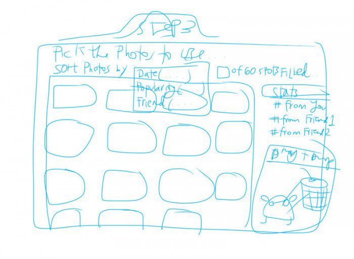
Now time to go onto the computer. If anyone on your team is more computer-friendly, then I would say go into Gimp/Photoshop and make the drawn sketches into real-looking mock-ups of the website. (You can do this in Powerpoint/Keynote as well, but I advise — just learn Gimp/Photoshop skills, they will serve you insanely well).
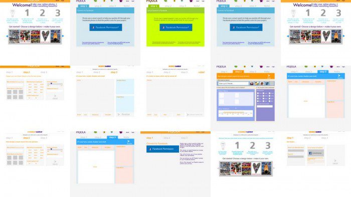
These prototypes will be more high fidelity, that look like the real thing, but are not truly interactive, just click-thru interactive.
Once you have the mocked-up versions of each of your sketches, time to make a faux-website. Put the mock-ups into a Powerpoint, in an order so that you can put a user in front of them and have them “click-through” the website. They’ll essentially be just clicking through the Powerpoint, but it will have more of the feeling of the real website.
From there, you will refine even more. This will help in the more fine-tuned details:
- what should layout be,
- what colors are good,
- what font sizes should be,
- what should be ‘called out’,
- what the form/shape/color/size decisions should be….
Essentially now, you are in Information Design territory, and need to be figuring out what design is needed for this material to be clear & usable to this audience.
Like with Step 2, use the user feedback to test your hypotheses about what the user wants, needs, and enjoys. Repeat, and repeat, and repeat with tweaking the pages’ design until you can get great, excited feedback from your users. Now you are done, move on to Step 4.
4. Publish a First-draft of your Website
You’ve got your interaction design choices, your information architecture choices, your information design choices made (at least for now…). You are ready to dive into the actual website building.
My recommendation: use the wonders of WordPress to do all that for you. If you know html & css, go wild & actually build the site you’ve designed. If you don’t, then use the great (and largely free) resources that WordPress has to offer to mix-and-match together an approximation of the website you’ve designed in Steps 1-3. It will not be exactly what you had designed, but it will be close enough to get the feedback you need.
Get a hosting account with Bluehost or Dreamhost or something of the sort (this is where all your website files and data will be stored, on their servers). Find a domain name (this is the web address name for your site) through namecheap and buy it for 11 dollars. Do not spend more for just a project that is not yet a venture, but still just a concept.
Log into your hosting account, and assign the domain you bought from namecheap to your account (you can find directions at the host).
Now install WordPress on that domain (again, find directions at your host, it will be a few easy steps).
5. Find a template to fit your design.
Now, the really fun part: go Template shopping. What I recommend is that instead of coding the web design that you created in Step 3 (feel free to do that, or to hire a developer to do that, if you have the time & the money….) — you find a great, pre-made WordPress Template that is similar to the design that you arrived upon for your site.
There is a huge amount of wonderful design from professionals, that is affordable (under $50), and worth the investment. You can take their great design fundamentals, and then customize it to fit exactly what your group had designed in Steps 1-3.
I recommend hunting around ThemeForest, to find the right theme for your project. These are themes that run from 30-60 dollars and are up-to-date, powerful, and often gorgeous. Or, you can check out some highly reviewed new themes here, this curation may be helpful.
There are some nice, simple free themes here from WP Shower. And a list of a mixed-bag of free themes here and also here.
Once you find a free or paid theme that works for your design, here are instructions from WordPress about how to install & start to customize the theme. The developer who built the theme you chose should also have instructions on customizations and other things you may want to do.
6. Add Functionality with Plug-Ins
After you find the right Theme, the next step to take is to find great, amazing Plug-Ins for your site. These add amazing & up-to-date features that you may want for your site. You can find lots of great free ones, or pay for the more professional ones for WordPress. Again, stick to your design that your users had validated — and find the theme that most resembles this design.
Plug-ins add greater functionality to your site — to take it from just being a website, to a more interactive and rich experience. If in your design, you had designed in some special kinds of interactions, you can hunt down a plug-in that will help you do this on your site. Here are directions from WordPress on how to install & deal with Plug-ins.
7. Keep Tweaking, and Testing, the Live Site
Now, the last step is going back to our beloved cycle — put it out there, user test, get feedback, tweak and tweak and tweak, and repeat steps 1-3. You’ve built a live website, don’t be afraid to play with it and change it as you get feedback from users.
You can also use Google Analytics (set up an account with Google, and they will tell you how to install it on your WordPress site) to track how people arrive to your site, where they leave, what pages they visit — all of this is feedback to use to figure out what on your site is working, and what is not.
Another option is to install a plugin that asks users for their feedback as they are browsing — it may be annoying and not get many responses, but it could also get you some more feedback.
Keep using the feedback loop to keep improving it. By the time it comes to present your project to your teachers, investors, or whomever else, you will have lots of user feedback and validation to show them. This is priceless — so don’t skip it, no matter how tempting the shortcuts!
8. Build it from the Ground-Up
You should now have a pretty awesome website, that users like and that fits with your vision. But if you want to go beyond the class project or the start up pitch — perhaps it’s worth it to make the website built from the ground up.
You can either hire a developer or learn how to code — and take the working WordPress version of your website and build it exactly how you want it to be, customized for your project. This will be time/money intensive, so again, go through steps 1-7 and make sure your design is viable, lovable, and usable before you invest all of this money and time into building your dream site.
It may also be fine to keep going with your WordPress version if it’s working well & you’re not in need of lots more customization or security measures. You’ve got a working website that users like, so don’t jump into this step unless you need to.
———————
I hope this step-by-step helps. You can move quickly through it — get ready to sketch & learn some new skills — don’t go for perfection, just go for rough-and-ready enough to get quality feedback. Hopefully, by the end, you will have a usable, useful, and engaging product for users!

2 Comments
Have you used any of these themes? I have trouble making the themes look the way I want. The default fonts are horrible and there seem to be limits to customization. I don’t find any of these things particularly easy to use and I handcoded my websites in 1996 in HTML and learned how to use slashcode. So I am not completely inept – maybe just too old. I
Yes, that’s the problem with WordPress themes, you end up spending so much time trying to overhaul the defaults. But as a first skeleton, I think it’s a great prompt to force a team to think hi-fidelity rather than just low-fi.