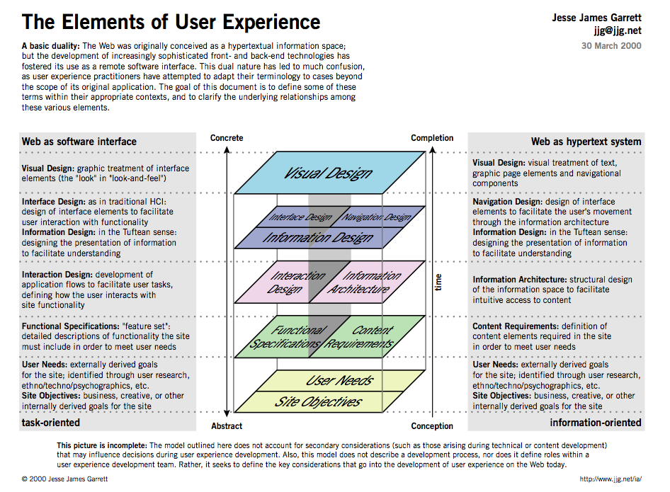
This excellent graphic from Jesse James Garrett should provide a fundamental basis for law-people to orient themselves in the world of User Experience design.
Many interwoven tasks go into a good design, besides just choosing colors, fonts & shapes:
1) scoping out the user needs through quality, deep user research
2) writing the specs that are required to fulfill those needs
3) sketching out the storyboard of how the product will cover all those specs, and address the needs
4) constructing a flow of tasks that users will journey through in order to satisfy their needs on the site
5) building the information architecture of how the tech will be structured to underpin this flow
6) crafting the front-end interfaces that the users will interact with, in order to follow this flow
6) finally choosing the visual treatments — colors, fonts and shapes!
This little list is not meant to be a definitive design process for developing user-facing tech products. From my experience, the steps are often jumbled or simultaneous. I shouldn’t admit it, but sometimes I start near the end and only later do I force myself to start back at the early (very necessary) steps. But hopefully this visual & list will help ground the aspiring-designer/developer in what goes into a good design, and create a malleable timeline for managing your project.
