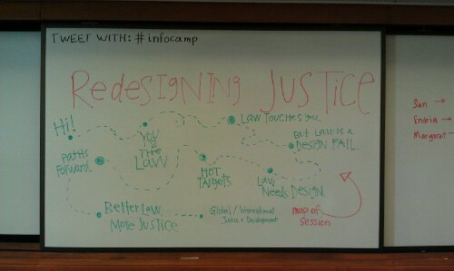
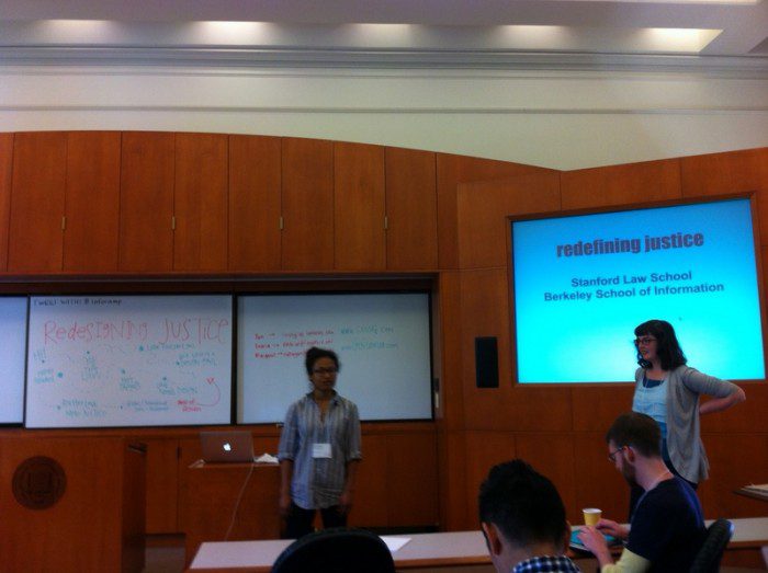
I went to InfoCamp today at Berkeley with the intention of soaking up best practices and inventive ideas from User Experience Designers and Information Junkies at the School of Information. I did do that — but ended up putting together an impromptu 50 minute presentation /slash/ participatory design session /slash/ user research focus group all on Redesigning the Law. Endria, also a Stanford Law 3rd year, was my co-leader & instigator, along with San Ng, who is a fellow at the I-School and works in international development/law/technology on innovating justice.
We put together a short game plan for how to get an audience full of designers, information scientists, programmers, entrepreneurs, etc. interested in the Wicked Problems of Law — and convince them that they should come work with us on tackling Legal Problems & building Legal Solutions.
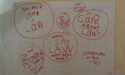
Our opening gambit was to ask people:
- How has law touched your life?
- Have you ever had to hire a lawyer?
- Have you ever used a legal document?
- Have you ever had to go to court?
- Have you ever looked up legal information online?
We were trying to learn ourselves, what are non-lawyers’ mental models of law — as well as their sentiments towards law, lawyers, and courts. Answer: a handful of people have had “legal experiences”, several of which have been Confusing, Opaque, Difficult to Navigate, Without Clear Guidance, Overwhelming. Some had business and corporate work done, or immigration assistance from their employers’ lawyers — and had fairly good experiences with lawyers (found by companies) who helped them out.
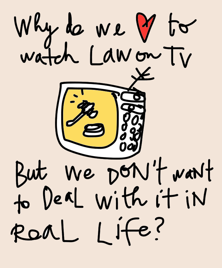
But when Endria asked what the first 3 words that came to their minds were, when the word Law came up, they were universally negative: Bureaucratic, Confusing, Opaque, Difficult, Boring, Expensive…
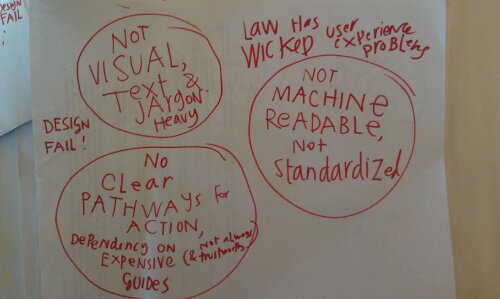
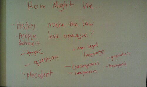
We moved from there to talk about the “Design Fails of Law”. We showed a House Bill about legalizing marijuana, and we showed a criminal Rap sheet on the overhead. The reactions: confusing, unclear what the topic is, full of information I don’t care about, not prioritized, where is the table of contents, how can I know what the topic is? Here are some of the information that the Bill was missing, that the users wanted:
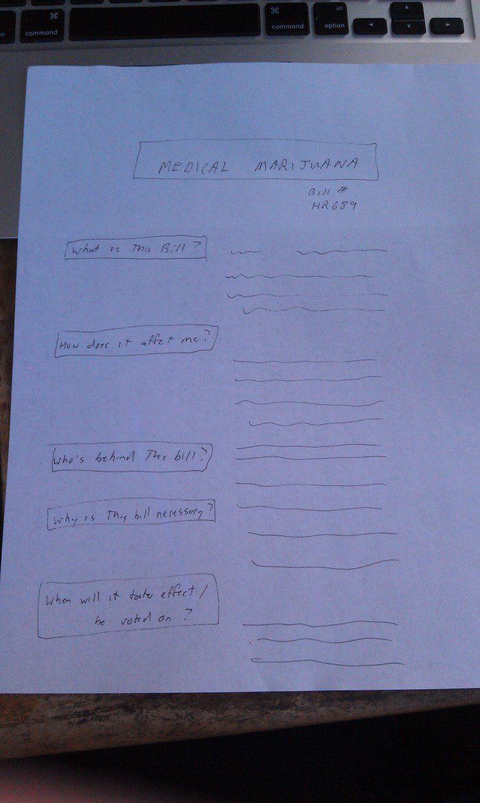
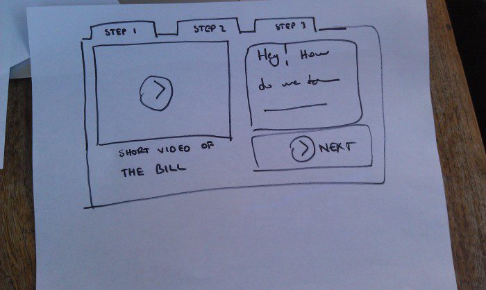
So we had a 3 minute design challenge. We passed out pieces of blank white paper, and gave the room full of participants the chance to redesign the front page of the House Bill to make it more clear. Here are some of the results:
We also got some takeaways about how we might redesign all kinds of public-facing legal documents — as well as other user research insights of interest:
- Documents should, on their face, provide glance-able, quickly navigable table of contents that will take you exactly where you need to go inside the pile of text
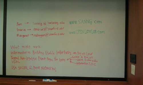
- If law-makers and lawyers won’t create usable documents, we need to train intermediaries to build usable interfaces on top of this legal output
- A bill or a law should have a front page that is Visual & Clean, featuring the information that users most want to know: what topics are talked about in this document (perhaps presented as tags), in particular: what changes does this bring from what was before, who is affected and who is not, what is the history/background/sponsor group for this.
- Legal knowledge might be better passed through channels that resemble peer and family networks, because users don’t trust lawyers or legal officials (bad reputations, as untrustworthy, unfriendly, and not-on-the-user’s-side).
- Law sounds BAD, Justice sounds GOOD.
- The Bay Area may be treated just like ‘developing countries’ would be: we should build micro-justice resources that help people here find legal resources and help, just like some international development bodies are doing in Kenya and Thailand.
- Users want lawyer reviews — they really want peer recommendations and data from courts & practices to be able to figure out what lawyer to use — this is a huge need.
- Legal redesigners should look to the medical field to see how the nurse-practitioner vs. doctor movement might help law to move forward in bringing non-lawyers (or, significantly less expensive and more user-friendly lawyers) into the delivery of legal counsel and support.
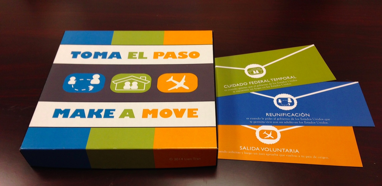
- Legal redesigners should find incentives to get people into the door for Preventative Legal Services — sign up for legal check-ins now, get discounts on legal services in the future? Force airport-goers, bus-riders, other random people to think about their legal futures? Build law games that sneak legal reflection & knowledge into people’s every day lives.
- Law & governance redesigners need not just build better presentations of law, but figure out how to get people to care about law & government, to find their sites, to make the argument that Law Matters and You Should Participate in Your Government — Onboarding is more of a challenge than building beautiful interfaces.
- Stanford d.school & Law School need to collaborate with Berkeley’s I.School & Law School to build a legal redesign program — that can convince developers, engineers, information scientists, designers, and more to come work with us on building incremental solutions to all these challenges.
And with all those insights, time to move forward to start playing with them and figuring out how to make some awesome stuff that takes on these challenges and addresses these needs!
